


Due to unfortunate accident (the store was robbed) and National Championship in Machine Dance I did not have much time to do some thorough research.
Influence sources - Tolkien or Peake
This week I decided to do some research on things that influenced the FA artists and what influence have art directors. For the first one, I noticed that many people reference Frank Frazetta. Though artist that emerged later usually reference artist that already work at the same company they ended up in. Todd Lockwood whose first artistic influence was Frank Frazetta and later Michael Whelan once said. "I flipped when TSR started having really good art in their products... Jeff Easley's stuff particularly interested me: so moody and fluid, so deft. Then Brom came along and really blew my doors off."[1] When observing Lockwood's work I always think of Jeff Easly and Michael Whelan. But the way Lockwood draws characters...it reminds me of Brom. I never searched for information about Lockwood's influences before. Finding about his influences did not surprise me at all. Also I can see why Lockwood likes Brom. Well, I always loved Whelan's illustrations of Elric and they remind me of Brom's work. Color, composition and the expression. The feeling I get from these images. Seeing some of the Elric illustrations I think of Brom.
Why is that? Or why I actually talk about these illustrators (Whelan and Brom)?. Todd Lockwood's and Jeff Easly's work is all bright in a way. On the other hand Whelan's and Brom's work is dark and gothic. Why? Whelan was doing illustrations for Moorcock's Elric and that book (and other of his books) need a certain style paintings. I think that Whelan did a really great job on that. Moorcock is s supporter of Mervyn Peake (stsung's note: really scary and wierd books and poetry). The Gormenghast trilogy (by Peake) is something considered by many as a classic and is compared to J.R.R Tolkien's Lord of the Rings. But Moorcock (being influenced by Peake) certainly does not really like Tolkien's LotR as Tolkien sees the fantasy world (well the Shire to be more precise) as Merry England (a utopian conception of English society and culture based on an idyllic pastoral way of life that was allegedly prevalent at some time between the Middle Ages and the onset of the Industrial Revolution [wikipedia]). Elric of Melniboné (by Moorcock) is an antithesis for LotR and this has to show on the illustrations. Brom's work is influenced by Moorcock a lot. We can clearly see that in his work. But there are people influenced by Brom and Whelan and both can be traced to Moorcock or Peake.
(This kind of division is much more visible in science fiction where the utopian and idyllic form one great part of science fiction and the rest forms (many subgenres) another great part of it. For example if you watch or read Star Trek you can clearly see the idyllic future.)
With this I covered one part of research.
Conventions
I've done some interviews this week. They were rather chaotic but there were things that came up from all the artists. Looking for an answer to a question about going to conventions came up from my twitter timeline. Artist tend to tweet about the next convention they will be at so people can come and see them. As you may know many fantasy artists go to conventions and at many conventions you can bring your portfolio and see if by a chance WotC (or other company) wouldn't be interested in you. (Actually I've requested the WotC Fantasy Artist application form several years ago and I was overwhelmed by the requirements.)
Why FA artists go to conventions? They go there to show their art, to see other artists work, to talk to the artists, to sell their art and so on. Many of the artists know each other and see each other at such places. They influence each other as well and motivate each other. I think that this is something relatively special not seen with other kind of art (science fiction is actually similar to FA) and that's why I think this is also something that should be researched more.
Fine Art
After talking to several artists (several years ago) and this week's interviews I noticed one thing. Many of the artists do card games illustrations, rule book illustrations and book covers but minority of them does fantasy art as 'fine art'. When I was talking to rk post he said 'Some cross over to fine art...and the fine art world seems to embrace them. Like Chet Zar, for instance. Brian Despain has done the cross over. [...] strictly gallery. No story telling.'
This finally defined my 'commercial' and 'non-commercial' fantasy art. The art meant for commercial use is illustration to a story, it has some kind of given background already (like setting). The non-commercial one does not though and we don't have so many artists that do 'Fantasy Fine Art'. But all these illustrations and such are considered Fantasy Art. Hm???
[1] Kenson, S. (April 1999) "ProFiles: Todd Lockwood" Dragon Magazine (Renton, Washington: Wizards of the Coast) (#258): 96.
Monday, October 31, 2011
Friday, October 28, 2011
S'Tsung playing Legacy no.4
Labels:
Visual Production
0
comments
Everyday I would like to produce some drawing, painting or anything else that can be produced.
Today I was rather stuck with 'what to draw'. So I ended up doodling some characters...After a while I came across a photo of me playing Magic. That day a big Legacy and Vintage tournament was held in Cerny Rytir and thus photos from the event can be found on the internet. A friend of mine did few photos that day...
I took a paper and pencil and tried to draw what I saw but after 3 hours of trying to do that I gave up. I looked more closely at the photo and my completely wrong drawing and started a new one (still on paper). I realized my errors and tried to correct them but it was still difficult to do...I couldn't come up with anything that could serve me as a reference in the picture.
In the end I opened photoshop and tried sketching the two tables and the outline of my body several times to see if I can actually see what is correct and what not. In the end I came up with something that seems correct.
This little drawing took me about 5 hours to figure out. I learned about all my incapabilities of trying to draw something in space or the correct perspective and in the upcoming weeks I'll try to learn something more.

Thursday, October 27, 2011
Um...
Labels:
Visual Production
0
comments
Upcoming post shows what led me to these two drawings. I show them to you here so you can compare. I learned a lot about what I can't do well. That's usually the first step. One needs to learn about the mistakes and weaknesses and then he can progress. Now I know what I have to work on.
Here me playing Magic.
Here me playing Magic.
 |  |
Wednesday, October 26, 2011
Photography, Intention?
Labels:
Visual Production
0
comments
During our today's erm already yesterday's critique we had a discussion about photography as an art and the what intention we have when taking and presenting photos.
The actual editing (like choosing what to present) and presentation (how we are going to present it) is something difficult and even though we like something we might end up simply not showing that in the end as it simply 'does not fit'.
So well I decided to take few photos today (yesterday) and see what it would give me. I wanted to do a series of macro photographs of things I can come across in the game store.
When looking at the photos individually I chose several I liked. I put them together but it just did not work at all...
Then I remembered what the teacher said today. He said that it would be nice to see a context or well see all the photos at once. So I took all the photos and opened them in photoshop (it did not crash hopefully) in a way so I could see them all at once. At that very moment I saw 4 photos that seemed perfect for the presentation. The number already led me to a composition. Note that my previous picks were different and for example the lower right photo was out of question for me. But in the final picture below it seems to fit (at least to me, everything is subjective in this case I guess - opinions differ, but how it is it feels right for me in a certain way I can't describe)
Anyway all these photos are rather technical...not really expressing mood or showing something that could be art.
On the other hand here is a photo that I took because for me the lights were reflecting some kind of mood and I found it mesmerizing.(the quality of the photo is bad...but still reminds me of how it felt when I was standing there)
The actual editing (like choosing what to present) and presentation (how we are going to present it) is something difficult and even though we like something we might end up simply not showing that in the end as it simply 'does not fit'.
So well I decided to take few photos today (yesterday) and see what it would give me. I wanted to do a series of macro photographs of things I can come across in the game store.
When looking at the photos individually I chose several I liked. I put them together but it just did not work at all...
Then I remembered what the teacher said today. He said that it would be nice to see a context or well see all the photos at once. So I took all the photos and opened them in photoshop (it did not crash hopefully) in a way so I could see them all at once. At that very moment I saw 4 photos that seemed perfect for the presentation. The number already led me to a composition. Note that my previous picks were different and for example the lower right photo was out of question for me. But in the final picture below it seems to fit (at least to me, everything is subjective in this case I guess - opinions differ, but how it is it feels right for me in a certain way I can't describe)
Anyway all these photos are rather technical...not really expressing mood or showing something that could be art.

On the other hand here is a photo that I took because for me the lights were reflecting some kind of mood and I found it mesmerizing.(the quality of the photo is bad...but still reminds me of how it felt when I was standing there)

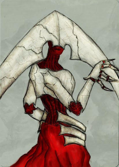
Desolation Angel
Labels:
Visual Production
0
comments
Another drawing I made. I couldn't come up with a form or the idea of what it should be. But the drawing was already reminding me of desolation angel so I went for it.

Tuesday, October 25, 2011

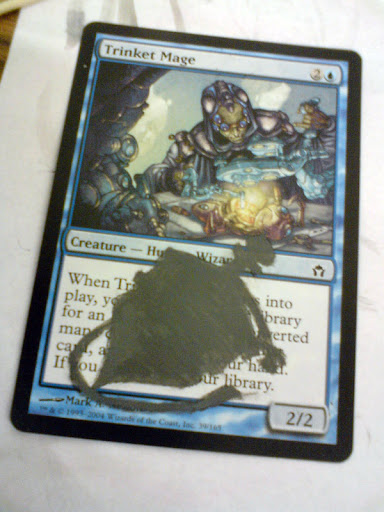


Trinket mage fetching for Sensei's Divining Top
Labels:
Visual Production
0
comments
Background was the first step, now I tried the 'content'. I did not want the top to be so bright as on the original image so in the end it ended up really dark. I wanted it to be dark so the focus would still be on the Trinket Mage nor the top.
In real life it looks much better. The scan though shows how inaccurate I was when doing this and what needs to be improved.
In real life it looks much better. The scan though shows how inaccurate I was when doing this and what needs to be improved.

Monday, October 24, 2011
Question
Labels:
Reflective Case Study
0
comments
Who is the one defining Modern fantasy (nowadays)?
(what led me here is only in hard copy - I'll retype it if I'll still have the time during this night)
(what led me here is only in hard copy - I'll retype it if I'll still have the time during this night)
My previous posts commentary
Labels:
Reflective Case Study
0
comments
Monday, October 10, 2011
In relation to Visual Production class I would like to explore drawing/painting techniques. As I'm interested in character design and 'fantasy art' I would like to discover what that is and from where the popularization and globalization of sword and sorcery came.
What I have in mind would help me in the future to become professional fantasy artist. It would give me the basis from which I can continue to progress and find my niche.
I would like to produce an interactive work but my interest leads me in a different way. Still conveying a message does not always mean 'wall of text'. So there is space for more.
Tuesday, October 11, 2011
When researching I encountered several thing that reoccur.
When trying to figure out what to do for Visual Production class I realized that fantasy art (even though I already speak here about a subgenre of fantasy)can still be divided into two groups - concept art and fine art.
More and More I see Asian influences in modern fantasy art. Also Asian illustrators show up on the scene. This has brought many discussions to the fantasy reading public, gamers and role players.
Monday, October 17, 2011
I was researching ...something. I hoped that this something would lead me to where fantasy started to be accepted by people. I found my answer - after LotR was published. People were open for more fantasy and simply wanted more. Here I found also why generic and future fantasy settings are similar to Europe in Middle Ages (see Middle Earth of Tolkien)
Following, Dungeons and Dragons by TSR enforced that and especially Ed Greenwood created a world people could easily familiarize with. That being Forgotten Realms
Various settings were published - Greyhawk, Ebberon, DragonLance, Forgotten Realms - all reflecting already well known notion of a fantasy world. Magic: The Gathering with its Multiverse did the same (different planes each being different in setting but still resembling (Middle)Earth more or less). One exception (to European based setting)was published - Oriental Adventures (Legend of the Five Rings) based on Feudal Japan (even though you will find Chinese, Korean and Mongolian elements + magic and magical beings ie. spirits, demons)
Saturday, October 22, 2011
Martin McKenna is the one who helped me to grasp what I was looking for and showed me that what I think is what he thinks as well.
Pre-50s the reading public wasn't prepared for fantasy even though popularity of pulp fiction grew and was becoming less 'pulp'. It was still rather underground. In 1955 LotR was published and readers of all ages and education simply wanted more of this 'faerie world'.
In 1973 D&D was published based on wargaming rules and games that evolved for Gary and his friend to what we know as RPG today.
Fantasy novels, books, magazines emerged and the quality of covers and inside illustrations started to be better,
A lot of illustrations were needed for TSR's rule books, magazines and modules.
In 1993 trading card games appeared on the market which meant a lot of work for many fantasy artists.
As the notion of fantasy mostly means sword and sorcery, it starts to get generalized and we can clearly see archetypes. Now fantasy is being popularized - we have movies, games and books that are easily accessible.
brainstorming notes.
- fantasy fans are conservative in nature
- there are still many Tolkien die hard fans
- evolution of fantasy can be thus rather difficult
personal [speaking about topic] as that will drive us forward
In relation to Visual Production class I would like to explore drawing/painting techniques. As I'm interested in character design and 'fantasy art' I would like to discover what that is and from where the popularization and globalization of sword and sorcery came.
[topic] that will help us in the future
What I have in mind would help me in the future to become professional fantasy artist. It would give me the basis from which I can continue to progress and find my niche.
ad 3d animation/sound production
I would like to produce an interactive work but my interest leads me in a different way. Still conveying a message does not always mean 'wall of text'. So there is space for more.
Tuesday, October 11, 2011
When researching I encountered several thing that reoccur.
- J.R.R. Tolkien
- Magic: The Gathering
- Dungeons and Dragons
- Wizards of the Coast/TSR
When trying to figure out what to do for Visual Production class I realized that fantasy art (even though I already speak here about a subgenre of fantasy)can still be divided into two groups - concept art and fine art.
More and More I see Asian influences in modern fantasy art. Also Asian illustrators show up on the scene. This has brought many discussions to the fantasy reading public, gamers and role players.
Monday, October 17, 2011
I was researching ...something. I hoped that this something would lead me to where fantasy started to be accepted by people. I found my answer - after LotR was published. People were open for more fantasy and simply wanted more. Here I found also why generic and future fantasy settings are similar to Europe in Middle Ages (see Middle Earth of Tolkien)
Following, Dungeons and Dragons by TSR enforced that and especially Ed Greenwood created a world people could easily familiarize with. That being Forgotten Realms
Various settings were published - Greyhawk, Ebberon, DragonLance, Forgotten Realms - all reflecting already well known notion of a fantasy world. Magic: The Gathering with its Multiverse did the same (different planes each being different in setting but still resembling (Middle)Earth more or less). One exception (to European based setting)was published - Oriental Adventures (Legend of the Five Rings) based on Feudal Japan (even though you will find Chinese, Korean and Mongolian elements + magic and magical beings ie. spirits, demons)
Saturday, October 22, 2011
Martin McKenna is the one who helped me to grasp what I was looking for and showed me that what I think is what he thinks as well.
Pre-50s the reading public wasn't prepared for fantasy even though popularity of pulp fiction grew and was becoming less 'pulp'. It was still rather underground. In 1955 LotR was published and readers of all ages and education simply wanted more of this 'faerie world'.
In 1973 D&D was published based on wargaming rules and games that evolved for Gary and his friend to what we know as RPG today.
Fantasy novels, books, magazines emerged and the quality of covers and inside illustrations started to be better,
A lot of illustrations were needed for TSR's rule books, magazines and modules.
In 1993 trading card games appeared on the market which meant a lot of work for many fantasy artists.
As the notion of fantasy mostly means sword and sorcery, it starts to get generalized and we can clearly see archetypes. Now fantasy is being popularized - we have movies, games and books that are easily accessible.
brainstorming notes.
- fantasy fans are conservative in nature
- there are still many Tolkien die hard fans
- evolution of fantasy can be thus rather difficult
Sunday, October 23, 2011
Elf - warrior
Labels:
Visual Production
0
comments
After going through quite a lot Dungeons and Dragons material I decided to do a sketch of something that could come from D&D 3e and later.
So here's an elven warrior. (edit: I'll try to color it once again later).
Now more about why I did this. Maybe you know Ed Beards Jr. I know him as a fantasy artist even though he does a lot of other stuff as well. He's a master with pencil for me so I tried some pencil work. More should come... I'm just trying to figure out what works and what not.
So here's an elven warrior. (edit: I'll try to color it once again later).

Now more about why I did this. Maybe you know Ed Beards Jr. I know him as a fantasy artist even though he does a lot of other stuff as well. He's a master with pencil for me so I tried some pencil work. More should come... I'm just trying to figure out what works and what not.
Saturday, October 22, 2011
Back to the Roots - Middle Earth vs other fantasy worlds
Labels:
Reflective Case Study
0
comments
Looking at the languages from ME and our world we can see a clear connection and something like this (creating the hoarding memory) can be seen in later fantasy both written and illustrated work.
For example Tolkien used some words for certain things like Mithril (metal) or Warg (dire wolf). Both of these words have roots in a certain language already but if it wouldn't be Tolkien who started to use these words the wouldn't show in other fantasy settings. In Dungeons and Dragons we now have Mithral and Worg having the very same meaning (not only in D&D). This also applies to races and class archetypes. For example Tolkien wrote the story about Bilbo the Hobbit. In D&D we have Halflings, that were also called hobbits in the beginning and resembled Tolkien's hobbits very much. Ents are common as well, we call them Treefolk in general but well, what comes to your mind when someone says Treefolk (Anyway changed to Treant in D&D)? Orcs as relatively intelligent but evil creatures also come from LotR and I could go on...
The fact that ME has it's own history (3000 years old), its own geography etc also led other people when creating fantasy worlds to have this as well. Not just races like elves, dwarves, gnomes etc but also the whole geography and history starting with the creation of the world (or the myths and legends if there aren't some immortal elves that could tell you the story from first hand^_^)
I give Dungeons and Dragons as an example but that game was not entirely and directly influenced by Tolkien himself as many people claim and write studies about. This game was influenced by many fantasy authors, Tolkien among them. (there were legal issues between TSR and Tolkien and later a de-tolkienization took place in D&D)
(Dragon Magazine, gotta find them)
I personally never took D&D as something relating to Tolkien, none of the fantasy from TSR/WotC seemed similar to Tolkien to me. Yes, I admit they have the same/similar races and names/terms used but that's more because this has already been established. D&D though defined it much more and many people derive from this today. And as many illustrations are done for all this 'gaming industry' it tends to become similar in design.
When seeing artists write about their influences they many times name artist working for the same company or writers that are not actually Tolkien.
But still without Tolkien our minds wouldn't be open for something like this - fantasy and that's why we have to give him credit.
Now the question coming from all this is: How come Fantasy Art artists are not influenced by Tolkien (with the exception of Ted Nasmith) when everyone seems to think that it was him that started Modern Fantasy?
Here I feel that my knowledge lacks a lot of information. I know a lot about the history of RPGs (TSR/WotC) and a lot about Tolkien's work. But I don't see the analogy (I do in certain things, but those were already described in Dragon Magazine) and the very same is about the art. Here's Ted Nasmith and Alan Lee on one side (Tolkien) and other artists on the other. Do I see resemblances? Um not really...
Back to the roots - J.R.R Tolkien
Labels:
Reflective Case Study
0
comments
When I was 10 years old someone in our family came home with a copy of J.R.R. Tolkien's The Lord of the Rings (LotR in short). This is a trilogy published in 1955 (Fellowship of the Ring) and 1956 (Two Towers, Return of the King). I finished the book quite fast and was fascinated by it. I'm not really sure what exactly it was that so made me crave for more. But it happened and I wanted to read more from fantasy worlds like the one of Middle Earth. I read everything from Tolkien that was published by that time and then read his biography and commentary on his work. Later I started reading many fantasy novels and books that I could get my hands on. So where does this crave come from? We'll look on it after a brief biography of J.R.R. Tolkien.
J.R.R. Tolkien was born on 3rd January 1892 in Bloemfontein in the Orange Free State. His both parents died when he was young. Mabel - his mother - left J.R.R. Tolkien in the care of Father Francis Morgan - a priest at the Birmingham Oratory. At King Edward's School he developed his linguistic talent and later began inventing his own languages. (elven languages - sindarin and quenya mainly)
John Ronald Raul graduated at Oxford (English language and literature). During the World War he served the army. After war he worked as a professor of Anglo-Saxon at Oxford where he soon prove himself to be one of the finest philologists in the world. At that time he was already working on a collection of myths and legends that were later published under the name of Silmarillion. (HarperCollins 2003)
In 1937 The Hobbit was published. It was successful and people wanted more 'hobbits'.
The Lord of the Rings was published in 1955-1956. The book became so popular that it started a completely new era of 'Modern Fantasy Genre' (Christopher Mitchell 2003).
Professor Christopher Mitchel of Wheaton College, Director of the Marion E. Wade Center and also Assistant Professor of Theological Studies at Wheaton made a series of seminars and discussions concerning J.R.R. Tolkien and C.S. Lewis. In those he looked closer on the new 'taste' among the reading public and why Tolkien's work was so successful.
In late 1950s there was a huge discrepancy between critics considering LotR an inferior literature even 'juvenile trash' and the phenomenal popularity among the reading public. In the upcoming decade critics said that the Tolkien craze would fall into oblivion in few years. But even after 40 years we are still here with many Tolkien fans and people wanting simply more. At that time people noted that Tolkien's work is not read by a certain group of people(in this case - children, as this kind of stories were considered children's stories) but by a doctor graduated from harvard, solicitor, police officer, farmer, another writer etc. All these people though had something common. What was it that Tolkien gave them?
Later in his speech Mitchel started to talk about something called 'hoarding memory'. Tolkien used this term to talk about the memory Elves have. Elves in Tolkien's world are 'immortal beings' (they can be killed but if not they live eternally) and carry on the memory of the world. The hoarding memory can be found in myths and legends and in even later stories. All of those bear the memory of one original - religious - story. All the stories are a shadow to the very first story (the eden, kain and abel). We perceive such memories even in LotR (if we are familiar with the legends and myths from Silmarillion). All these try to awaken something in us.
Tolkien is taking us out from our own world to awaken us. All this starts with imagination. We reject our world thus we need to be awakened in another world and return back our own world to become awakened in it. This is not escapist as many people and mainly critics think so. (Tolkien/Lewis)
Why I write about this? In a way I agree. The thing is that the hoarding memory is there, it is something that we can trace. We might not consider it religious and looking at Tolkien influenced work (it isn't religious) but still it started somewhere and at that time it was religious. There is the universal truth underline in all there is in the nowadays work (and not necessary christian). J.R.R. Tolkien said that he is christian and that this can be deduced from his work. But did anyone notice that?
There are many people who noticed that but for most the fact that the LotR is cut from anything religious makes it hard to understand why such a book should be religious. One has to look deeper and find it for that it is good to read J.R.R. Tolkien letters and his biography. (J.R.R. Tolkien: A Biography by Humphrey Carpenter, edited by J.R.R. Tolkien and The Letters of J.R.R. Tolkien J.R.R. Tolkien, Christopher Tolkien, Humphrey Carpenter).
In these books we learn about Tolkien's personal and academic life. Ronald's life was a difficult one. Death of his father when he was 4 years old, death of his mother in 1904 and the stay with Father Morgan marked Tolkien a lot. Living during both World Wars is also something that has influence on one. (I would like to quote Tolkien when he was talking of himself as a hobbit, but I don't remember it exactly and I don't remember from which book it came). The claim 'I'm a hobbit' though tells us a lot about Tolkien if we are familiar with hobbits as a race or (Frodo or Bilbo Baggins).
Anyway in the letters we learn more about the spiritual look on Middle Earth and this cannot be denied as Tolkien wrote it himself.
Nowadays J.R.R. Tolkien LotR or Hobbit is considered as a must read book even by high schools (at least both I attended had this under 'obligatory literature'). But no one at the school actually gave me any insight on why and how LotR/Middle Earth was created.
In both books we learn about where certain things came from - Norse mythology for example and we learn about the creation of elven language and tengwar (written elven language - it means letters in quenya).
stsung's note:
When I was around 12 I was able to write in tengwar and was capable of reading a text in quenya. Study of this language taught me about other scripts and languages. Tengwar is alphasyllabary writing system and as I wasn't familiar with such systems it led me to discover primarily Devanagari and Sanskrit (I was familiar with phonetic writing systems - Japanese, Chinese, latin letters and cyrilic based systems). Elvish language is a constructed one but has a rules that can be easily followed and that tell one from the writing system what to expect and thus memorize and easily use.
In LotR and Hobbit Tolkien also uses two different runic systems that are based on anglo-saxon and norse writing systems (this is much more familiar as this system uses letters both consonants and vowels and uses the same way as latin letters. Germanic languages were using these before they started using latin letters).
By studying the writing systems, we fall back on ancient languages and mythology that also help us understand more the constructed world of Middle Earth.
Finding a topic for my RCS part 4
Labels:
Reflective Case Study
0
comments
"Pátrání mne přivedlo do kontaktu s vůdčímí výtvarníky z celého světa - ve Spojených státech, Asii a na středním východě, v Kanadě a jižní Americe, po celé Evropě. Na takové mezinárodní sbírce je fascinující pozorovat rozdíly i podobnosti moderního výtvarného fantasy umění, pocházejícího z nejrůznějších zemí a kultur po celém světě.
Ta nejlepší fantasy díla nám poskytují lákavou únikovou cestu do světa uvěřitelnosti, cestu kde se smazávají hranice mezi vnější realitou, kterou všichni sdílíme, a vnitřní duševní krajinou výtvarníka. Dnes je však zjevná jistá globalizace žánru fantasy, nepochybně díky vlivu všeobecně rozšířených fantasy filmů, počítačových her a dalších populárních médií ze Spojených států a Evropy. To často vedeke vzniku děl, která se snaží přijmout podobný výklad všeobecně známých témat fantasy.
Proto jsou si dnes výtvarné styly snažící se dosáhnout elegantního efektu hodně podobné, a to zejména v oblasti designu." (McKenna 2007)
Few years ago I received a book entitled Fantasy Art Now by Martin McKenna. It is actually a collection of work from the leading fantasy artists and from aspiring fantasy artists. Going through the book I realized that I already know most of these illustrations and if not the illustrations I know the artists (there are illustrations that were published in this book for the first time).
I made few observations:
1. On the illustrations there are many times depicted characters or scenes from something I already know. Is that the reason why the artists are famous and considered the leading artists? Because they are known via the commercial sphere?
2. There are similarities that we can observe and some kind of globalization of the fantasy genre (McKenna 2007). After reading the notes from certain artist I realized that none of them actually say that they were influenced by this or that fantasy world etc. but many note that they had this or that artist as an idol. (even though their work hardly resembles that one.)
McKenna's introduction (quoted in Czech above, I couldn't find the original one) actually summarizes my second point. According to McKenna we can observe globalization of the fantasy genres most probably because of fantasy movies and computer games on the rise. This leads to art that shares a common known fantasy themes/archetypes. This often results in similar designs of fantasy art. (this formulation is pretty bad, but now I just need to grasp the idea somehow). All this most probably fallbacks to Tolkien and later published Dungeons and Dragons whose fantasy setting was directly influenced by J.R.R. Tolkien's world.
When looking for something in my room I came across TSR Collectors Art cards and calendars. Calendars were for me a collections of Fantasy Art from certain artists as I couldn't buy prints of those work as I can most probably do nowadays. Among these I came across DragonLance and Ted Nasmith Lord of the Rings calendar. As those are relatively old. The illustrations from these calendars are from 1980s till late 1990s and they have something in common. Looking at these one can clearly see that highly realistic rendition of reality (with the aspect of fantasy theme) is there. The colors though being more fairy tale like.
"His approach to illustrating Tolkien draws on influences such as 19th century 'old school' landscape and classical painting, as well as 'magic realism', fairy painting, the classic illustrators, and the visionary/psychedelic art of the 1960s.
Besides the sheer pleasure of bringing Tolkien's world to light, he sees his fantasy art as a bridge between the realm of 'everyday' and 'faerie', faerie being Tolkien¹s term for the enchanted world of our dreams and nightmares; that great ancient-realm of Story." (HarperCollins 2003, Ted Nesmith Interview)
After looking at these illustrations and reading some of the comments I would like to take similar path as Martin McKenna. He created a collection of works with artist commentary to show it. In my case I'd like to research more were the globalization of fantasy art came from.
Friday, October 21, 2011
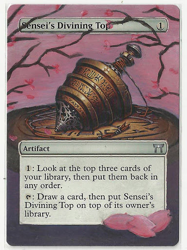
Sensei's Divining Top
Labels:
Visual Production
0
comments
After manga girl I decided to paint on Sensei's Divining Top. What I had in mind was this cards background to become pink(ish) with sakura trees and petals. This idea was already realized by someone - Yawgmoth - but I wanted to do this a year ago already. Now the time has come.
What I wanted to try and figure out is what base color I should use and what should I do to get a clear pink color on that base color. I ended up mixing ombre and buff titanium, but any shade of grey would work I guess.
After this coat I started adding more layers - pink. It resulted in a really beautiful color. It was so bright I had to do this process once again to make the color look dull.
When this was done I tried painting the sakuras and some petals. I finalized it the next day.
What I wanted to try and figure out is what base color I should use and what should I do to get a clear pink color on that base color. I ended up mixing ombre and buff titanium, but any shade of grey would work I guess.
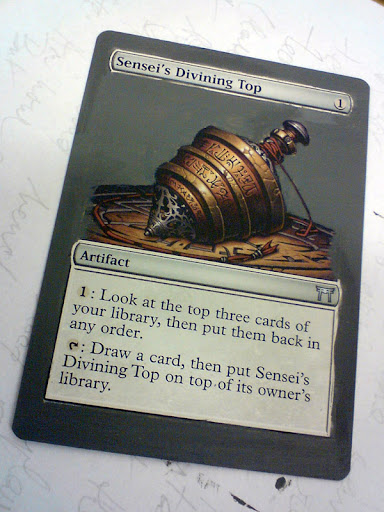
After this coat I started adding more layers - pink. It resulted in a really beautiful color. It was so bright I had to do this process once again to make the color look dull.

When this was done I tried painting the sakuras and some petals. I finalized it the next day.
Thursday, October 20, 2011
Color Out of Space
Labels:
Visual Production
0
comments
I picked up leaves from different plants/trees on our garden and assembled them. Here is what it ended up looking like. I actually took leaves forming one kind of gradient. I realized that I could create a different one starting with yellow once again but going through orange to dark brown. There are so many hues and colors outside!

Monday, October 17, 2011
Finding a topic part 3
Labels:
Reflective Case Study
0
comments
Last week I spent most of the time reading some magazine articles, web pages and some essays concerning Role-Playing Games, Fantasy illustrations, Fantasy illustrators and Jim Roslof (Fantasy Artist and Art Director for TSR).
Well, I wasn't really looking for something in particular. Just trying to figure out in which direction I should go and what my work would be about. Defining Fantasy is something difficult to do and well if I'm going to do that I'll just choose one point of view and try to prove it. Some people will disagree, some people will agree. But the most important thing is this - there are some borders for each individual that define fantasy. For some slightly erotic image depicted in a really weird way is a fantasy. For someone it would never be a fantasy picture. So what are the boundaries of Fantasy Art?
I stumbled across many articles concerning J.R.R Tolkien and fantasy in general. The Fantasy subgenre - Sword and Sorcery - is the largest and oldest in the role-playing games history. Fantasy RPGs (based on this genre) are set in medieval setting (Europe) that also has 'fantastic' elements. That can be magic, magical beings, gods, nonhuman beings (elves, dwarves, gnomes etc). Now comes the question - were these worlds influenced by Tolkien's books (Lord of the Rings, Hobbit etc?).
In late sixties Hobbit and LoTR were really successful in the USA. In 1973 Dungeons and Dragons was created and fantasy settings followed. (the original D&D is set in fantasy world that is really similar to Tolkien's one)
Lord of the Rings had a decisive influence on the emergence of RPGs. Due to this, elements of Tolkien's creations (that are already based on mythology - Nordic and German mosty) can be found in many fantasy worlds. This means both geographic places and names (mithral/mithril comes to mind), races (elves, hobbits/halflings, dwarves etc)...
Also the RPG classes (archetypes) were taken from LotR. Ranger from Aragorn or Legolas, hobbits being thiefs/halflings rogues, dwarvs warriors etc.
This does not really tells us much about art though. The illustrations for Hobbit and LotR done by Tolkien weren't really accepted at first and were 'published' years later. Most illustrations come from magazines, card games and role playing games settings/rule books. These are products of a company and companies have art directors for that. But for some reason the view on fantasy art seems rather similar. So what makes an art a fantasy art?
-----------------------------
In 1993 WotC released a fantasy trading card game - Magic: The Gathering which was a rather dramatic event in RPG history. Many RPG gamers switched to playing Magic and this meant that the RPG sales went down by a lot. The boom of trading/collectible card games ended in 1996. Very few card games survived, but some stayed Magic: The Gathering and Legend of the Five Rings notably.
Later the shares on the market became balanced and now both of these coexist together without ruining the other.
Manga Girl no.2
Labels:
Visual Production
0
comments
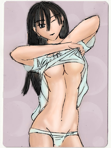
This time I decided to try carbon copy technique. I did not expect the carbon to be visible on the card's surface but in the end it looks fine (even on a really dark background). I decided to try this because when even drawing the very same image I drew already I usually mess up somewhere. I wanted to know where the problem lies and if I will have the same problems with...hm..not seeing the whole picture. And I noticed that as well when doing this.
Today, what I wanted to do is to carbon copy a previous drawing I made and then color it and try to add some details. I got a much better result then I expected but there is much more space for improving.
I scanned my image because I want to keep it and well because it is drawn on a really hard/heavy paper (multilayered), I printed it out. That was what I used to copy it.
After that I could see the copied outline on the card I wanted to alter. As I don't have aceton for getting rid of the original print I decided to paint over it and see if I can manage to cover the print fully. (here I need to try a different method, most probably I will try painting it black, then white and then I will apply the skin color - I'll try this next time, I have one more commission to do).
Then I started with the base coat. It was rather difficult to do, not what I expected. The base coat was actually yellow (it does not show on the picture...). After that I started with pink/orange/yellow layers.
When the layers were done - well more would be better I guess - I tried to outline everything and I realized that I forget one leg...ouch. That did not end up good.
Time for some hair color and final touches. I tried to figure out what to do with the face. It seems that I can't focus on something as whole. I need to work on that and be more cautious about that.
On the following photo, there is the original drawing + the final version of the painted card.
A scan of the card.
Today, what I wanted to do is to carbon copy a previous drawing I made and then color it and try to add some details. I got a much better result then I expected but there is much more space for improving.
I scanned my image because I want to keep it and well because it is drawn on a really hard/heavy paper (multilayered), I printed it out. That was what I used to copy it.

After that I could see the copied outline on the card I wanted to alter. As I don't have aceton for getting rid of the original print I decided to paint over it and see if I can manage to cover the print fully. (here I need to try a different method, most probably I will try painting it black, then white and then I will apply the skin color - I'll try this next time, I have one more commission to do).

Then I started with the base coat. It was rather difficult to do, not what I expected. The base coat was actually yellow (it does not show on the picture...). After that I started with pink/orange/yellow layers.

When the layers were done - well more would be better I guess - I tried to outline everything and I realized that I forget one leg...ouch. That did not end up good.

Time for some hair color and final touches. I tried to figure out what to do with the face. It seems that I can't focus on something as whole. I need to work on that and be more cautious about that.
On the following photo, there is the original drawing + the final version of the painted card.

A scan of the card.

Saturday, October 15, 2011

Friday, October 14, 2011
Manga girl no.1
Labels:
Visual Production
0
comments
We just noticed that most of altered cards on ebay are of manga girls...
 |  |
Wednesday, October 12, 2011

Tuesday, October 11, 2011
Finding a topic for my RCS part 2
Labels:
Reflective Case Study
0
comments
It has been several years that something started to bug me concerning imagery in role-playing games rule books, adventures, card games, fantasy magazines etc. In the past few years the art in these starts to get a bit more varied and a lot of new illustrators are becoming well known. But this has also started many negative reactions from players of these games and readers of these books/magazines.
In 1973 Gary Gygax and Don Kaye created TSR (Tactical Studies Rules) and published Dungeons and Dragons. D&D in short is a rules set for a fantasy setting role playing game. Something like that needs some illustrations right? This game has already several edition but between 2nd and 3rd there was a huge change in both the rules and the overall look/feeling of the game. This brought new artist and a whole new - mostly digital art - era started. The reaction of the people was varied but no one ever complained about the art not it was anything discussed by the players. Same 'revolution' actually awaited the card games and magazines and everything else published by the company (Wizards of the Coast who bought TSR in 97 just FYI). [1]
Few years back the Magic: The Gathering design team started a 3rd stage of design (if I remember correctly) [2]. It is pretty creepy, dark and realistic. The art is more varied, new artist both known and not known from the past (or other company's products) showed up. And this certainly has not come unnoticed.
The art produced has changed a lot since 1970s. And now more than ever the artists are influenced by Japanese anime/manga/fantasy stuff. This by many people is not accepted well even though many of those don't even recognize why they don't like certain image (Angelic Destiny - yes, certainly Japanese influence or Jace, the Memory Adept - author is influenced by comic books and his comic book characters happen to be special, this one looks more manga looking but probably the author did not even know about that). [3]
There has been a long discussion that had to be heavily moderated (because the users just couldn't come up with arguments and started to flame) but it showed that this is ongoing and still ever present. These images were done for a trading card game - Magic: The Gathering. I've done a research on Trading Card Games earlier. From that research I found out that more than half of people playing Magic got attracted to the game by its nice art. The art is changing and the people who loved the art earlier don't like the new one. This does not seem to be an issue as the art evolves with time and now in the mainly digital age the art is becoming more and more digital and realistic which actually feels 'right'. Or at least that's what we see everywhere. More and more detail but the 'niceness' and 'mythical flavor' are simply waning. (Compare Fallout 1/2 with Fallout 3 and 4. There has been a long pause between 2 and 3 and if I would have to give an example of what it was in the past and now, this is the game I would pick)
So now what is it that I would like to know? One day in the future I would like to become an artist and if I will draw/paint images they will be what we call now 'fantasy. But what is fantasy? One definition says this: The faculty or activity of imagining things that are impossible or improbable.. Nice but what we are looking for here is something that shows what can be considered as Fantasy Art. So what is Fantasy Art?
Nowadays after Sword and Sorcery magazine stories, TSR's Dungeons and Dragons, WotC's Magic: The Gathering Fantasy in the western (commercial) world is something which takes place in a medieval setting where magic and magical beings exist. That's the first thing that comes to mind when many people are asked about fantasy (would be nice to do a survey on this! hey (Magic)Salvation await my post!). But take Japan for example? Fantasy is something completely different and can range from heavy science-fiction settings to medieval occidental settings with magic to completely crazy by most never understood settings. None of what I stated above is definition of fantasy so it would be nice to define it.
In the past years images that are done for this kind of books and games are considered art and I have to agree with that. Many of those works are amazing and really stunning. But we have many other artwork that could be considered Fantasy Art but is not. So what defines it? Should Fantasy Art be defined on commercial level or make it more wide? I have to see what other people/artists/professors think about this. What impact had TSR/WotC on Fantasy Art? Because it seems their view on Fantasy is the general public one... How the public views Fantasy (Art)?
[1] http://www.wizards.com/dnd/DnDArchives_History.asp
[2] Can be found at Daily Arcana. (also wizards.com)
[3] Comes from Wizards of the Coast Magic: The Gathering Community Forum (community.wizards.com) but these cards were heavily discussed in our game store as well to the extent that by the end of the day I just couldn't listen to it.
[4]
1. Larry Elmore, Clyde Caldwell, Brom, Fred Fields, Tony Szscudlo
2. Tom Baxa, Tony DiTerlizi, Jeff Easly
3. Todd Lockwood, Dave Allsop, Ralph Horsley
4. Daarken, Izzy, Anthony Waters, Jason Chan
Monday, October 10, 2011
Finding a topic for my RCS part 1
Labels:
Reflective Case Study
0
comments
Our first lesson is over and the time for figuring out what the topic of my RCS came. I've been thinking a lot during the long holidays, but I had a lot of work to do and I had no free time to even reevaluate my life as is.
Anyway about the topic...
- it should be something personal as that will drive us forward
- it should be something that will help us in the future
(I couldn't formulate the second point) Anyway it gets problematic even here.
I got stuck at several things. From one point of view I should be doing something that can be helpful in my professional life but ok let's be more specific my parents don't expect me to be an artist and they don't like the general idea of it. So it goes back to why I started studying at Prague College.
I went to the school to learn about 3d animation and sound production. It is something that fascinated me and I wanted to learn more. I tried myself in my free time, but it was never that fruitful. At Prague College I really got the chance, learned a lot and could work hard on it. Though several things hampered this.
1. work
2. my attitude to certain people when they behave the way they shouldn't
This completely ruined my motivation to do anything 3d modeling related even though after working with 3dsmax for hours that it is still something that fascinates me and I would like to continue doing that. But I also learned one more thing: I can't do this for long. 5 hours lesson in which I spent looking at the screen and modeling was already too painful for my eyes. Ending up dry and red and I get really bad headaches and I feel sick afterwards. This means that for another day or two I can't see anything in 3d (on computer screen), if I do I'm sick.
Sound Production. Well, this is something that involves more spontaneity and more imagination that I usually come up with. It is fascinating and we had really motivating teachers, but I have to admit that this won't be anything I'd like to do in the future, nor as an artist nor as someone working for company.
What is left there? My 15 year lasting interest in web design and coding? This is something I would like to do. It is something I'd like to become much better and picking up scripting would be much better (php and MySQL). I have to say that I have big holes in knowledge concerning the evolution of web design (notably) and coding as well. I even completely missed CSS3. No matter what this is something I'll be doing in the future and I would like to dedicate part of my life, both professionally and for 'fun' let's say. (interest)
I was thinking about topics I could elaborate on. There are few things that struck me. First of all...I'm typing this blog post on a blogspot site. This blog's system is not done by me. Not even the way the blog looks (ok, I made the template look this way but ignore that for a while). From here two question arise concerning
- content management systems (joomla, drupal etc)
- website templates (be it for a shop, web page, CMS)
When I first started writing on the internet I had a page that I updated manually. Later when I learned about php I no longer needed doing this, but still many times it was the easiest thing to do. When CMS systems started to be widely used, many people started blogging. Sites like blogspot.com, wordpress.com were created. Here everyone can create an account and write about anything he or she likes. But many people are not really HTML/php/asp literate. Users want their blogs to look different from others etc. The need for user friendly stuff arose. (I could talk about this concerning any software and operating system). And that's where people started creating templates, CMSs, gadgets etc. This does not only means 'web code', but also graphics and some real programming language skills. (BTW do you know what pasting a text from MS Word to this window will do (actually not to the one I use now as it shows html code, but to the one many people use to write their text and edit it?)
So my first two questions are about CMS and templates. But what of it? I decided to drop the first question. Actually if I would consider it, I would like to know where the evolution and CMS modules lead us. Same with the templates, but here it took me in a different direction. I spent some time doing web design and I went through a period where everything blocky was in and when everything with rounded corners was in. But again in Japan...this has never happened. The stage of rounded corners, flashy stuff and so on came much later and even now is not the widely used 'look'.
Japanese sites are usually about the content and are most of the time terrible in design whereas here the design is something really important and many people expect a site to look good and be interactive. Does a culture influence web design?
Another question arose - How should a good commercial site be done?
There are many more things that come to mind but I can't really grasp them and turn them into a question. And trying to relate any of those to Visual Production is also something I can't really do and thus I decided to let it go.
The second topic which is really close to me is anything Fantasy Art related. As this term is not even established it was difficult for me to even search for information. I wanted to see the evolution of Fantasy Art used commercially but I think I should start somewhere else. Somewhere at the root of 'What is Fantasy?' But when considering this and my professional life...I can't really come up with anything (except the fact that I would really like to become fantasy artist one day)


Acrylic Paint Attempt no.1 - progress
Labels:
Visual Production
0
comments
Progress of 'mountain 1'
The starting point was a 88x63 mm white paper. I applied a base coat. I noticed that even slightest coat of paint makes everything easier and it also gives the general mood/tint to the final picture. I usually use relatively bright yellow but today it wasn't the case. I used buff titanium (yellow).
After this I let it dry for a while. Then I took a smaller brush and outlined what I wanted to paint. Here I already found out that to paint what I want is not that easy^_~.
Now it was time to start coloring. I started with the sky. I did not like any of the attempts at it...I repainted it several times but none seemed right. The color changed several times as well. At first it was relatively bright color, but it was getting darker and darker with bit of yellow added to it. In the end I think that if I would end in a night scene it would make me feel better. But the rest would have to shift in color as well - and for the time being I'm not sure how.
Later I added some green and shades of 'brown'.
When I saw that it actually starts to look somehow I decided to change the tint into something more vivid and repainted the sky once again. At this point I think it was the best one I managed today. But unfortunately it ended up looking completely different in the end. I added a bit of blue to the more distant 'mountains' to make it look more far away. But I guess that I wasn't that successful either.
Then I started adding some detail. Some grass and I tried to do something with the path and in the middle.
Here's the final scan.
I actually like the way it turned out in the end but I wonder what else I could do? Adding more detail for sure even though I don't know how. Even though I covered the whole area with paint, is it enough? Could more colors add more depth? Or having used less paint actually gives it a different feel and make it look good? (in this case I like the fact that I used less paint, many times transparent so you can see the base color underneath. I usually cover the whole area and nothing of the base coat color can be seem).
It seems that this picture as many other I've done earlier has a problem with scale. Or well there are elements that are close and should be quite large, but the objects in the distance should be ... well appropriately big/small. The way my image is done...how big is the 'mountain' in the back? and the stones alongside the road? They were meant to be 2-3 meters big but hm...but in reality how big they would be?
I read that when painting with acrylics one should go from darker color to lighter one. But I experienced a problem when applying superposing layer of lighter color on the darker. Sometimes the dark color stands too much. I use lighter color and I end up with two really distinct colors. How one goes on about blending? My usual way of doing this is to mix each time a slighter lighter shade and paint. But I sometimes tried to blend the two colors using a bit more of water - usually this does not end good but is it a good way to do? Would it work if done properly.
This probably concludes my first experiment.
The starting point was a 88x63 mm white paper. I applied a base coat. I noticed that even slightest coat of paint makes everything easier and it also gives the general mood/tint to the final picture. I usually use relatively bright yellow but today it wasn't the case. I used buff titanium (yellow).

After this I let it dry for a while. Then I took a smaller brush and outlined what I wanted to paint. Here I already found out that to paint what I want is not that easy^_~.
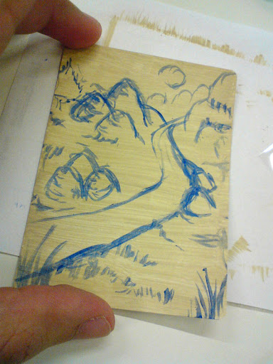
Now it was time to start coloring. I started with the sky. I did not like any of the attempts at it...I repainted it several times but none seemed right. The color changed several times as well. At first it was relatively bright color, but it was getting darker and darker with bit of yellow added to it. In the end I think that if I would end in a night scene it would make me feel better. But the rest would have to shift in color as well - and for the time being I'm not sure how.
Later I added some green and shades of 'brown'.

When I saw that it actually starts to look somehow I decided to change the tint into something more vivid and repainted the sky once again. At this point I think it was the best one I managed today. But unfortunately it ended up looking completely different in the end. I added a bit of blue to the more distant 'mountains' to make it look more far away. But I guess that I wasn't that successful either.

Then I started adding some detail. Some grass and I tried to do something with the path and in the middle.
Here's the final scan.

I actually like the way it turned out in the end but I wonder what else I could do? Adding more detail for sure even though I don't know how. Even though I covered the whole area with paint, is it enough? Could more colors add more depth? Or having used less paint actually gives it a different feel and make it look good? (in this case I like the fact that I used less paint, many times transparent so you can see the base color underneath. I usually cover the whole area and nothing of the base coat color can be seem).
It seems that this picture as many other I've done earlier has a problem with scale. Or well there are elements that are close and should be quite large, but the objects in the distance should be ... well appropriately big/small. The way my image is done...how big is the 'mountain' in the back? and the stones alongside the road? They were meant to be 2-3 meters big but hm...but in reality how big they would be?
I read that when painting with acrylics one should go from darker color to lighter one. But I experienced a problem when applying superposing layer of lighter color on the darker. Sometimes the dark color stands too much. I use lighter color and I end up with two really distinct colors. How one goes on about blending? My usual way of doing this is to mix each time a slighter lighter shade and paint. But I sometimes tried to blend the two colors using a bit more of water - usually this does not end good but is it a good way to do? Would it work if done properly.
This probably concludes my first experiment.
Acrylic Paint Attempt no.1
Labels:
Visual Production
0
comments
Yesterday, I told my parents about me wanting to paint and it provoked such a negative reaction that I decided to drop the idea altogether. The debate went on and I learned more things that I probably did not want to hear. All this changed my mood a lot.
There were three other factors that did not brighten my mood that day, one of them being serious and which certainly will have bad consequences.
I did not sleep much and was wondering about my life. When the night sky started to fade I finally fell asleep. Few minutes later my father got up, he couldn't sleep. At seven in the morning he came to me telling me that we are leaving for Prague.
I arrived to school and still wanted to paint my little experiment. When doing the draft I was enthusiastic and my mood was good and for a moment I forgot about all the problems that bothered me. My sketch was bright and colorful. Today I just couldn't come close to those colors. They just did not reflect my mood at all.
I'm writing this because you can clearly see that my mood has direct impact on what I create. I thought that I'm not really that influenced by this but I certainly am.
The day I was drawing my first sketches I had images of tropical islands, lively elementals (fire) full of energy. Yesterday all I could see was exposed flesh, blood, gore and innocent angel decapitated. I produced some sketches. I tore most of them, keeping just 2 (I'll post them later).
Today's experiment looks like this. In next post I will post photos of the progress and I will comment on that. (hopefully I'll start feeling better)
Sunday, October 9, 2011
Acrylic Paint Upcoming Attempt
Labels:
Visual Production
0
comments
I'd like to try painting but I have no idea where to start. So my approach will be this. I'll start on a really small area (more precisely its 88x63 mm) as this is I'm familiar with and can thus observe my progress and note down my new experiences.
I have problems with filling big areas (and in this case it can mean 3-4 cm)with something and detailing so I will try to come up with something that would help me with that.
For this I created a draft with pencil and that's what I'll try to paint when I get to school and I'll have few hours to work on it.
For the time being I'm presenting you here two pictures. One is of the pencil drawing and the other one is colored version. I will use this as a guideline to my little painting and we all will see how it will end up looking. For sure it should teach me something.
First of all, I'll need to buy a bigger brush so I can do the base coat in terms of minutes and not 1 hour as it usually takes me. Then I will follow these steps.
(1. base coat)
2. outlines of what I want to paint (tints of blue)
3. distinguish the dark places (and color them in the shades of blue)
4. color the whole thing starting with the sky and its tones
5. the rest - but adding more base coat for the ground FIRST and then trying to add more detail so it would look good. (I kind of fail in this sometimes so I'll pay attention to that)
After this I will note the difficulties I had and I will note down my experience following these steps. I'll discuss this with Jeremiah later. Hopefully he won't laugh^_~ He'll probably will as this is not by any means the way acrylics should be used. But if anyone would be interested in what I do, I might actually write a little paper on this. Because from the start of artist painting on (trading) cards (here you finally find what I do) this has become an art in itself. But I'm not good at it - yet. ^_~
 | 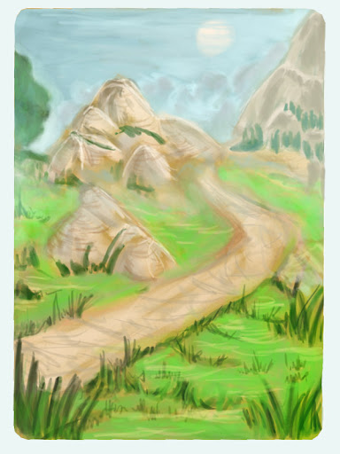 |
Acrylic Paint
Labels:
Visual Production
0
comments
I'm no expert at painting and I never got painting lessons. I used tempera paints and watercolor earlier. The first was relatively ok, but the second was horror. It simply was not behaving as I wanted and exploiting the errors as many people were telling me was not something I managed to do. I gave up on this quite soon not really finding out what it can offer.
After years of drawing and digitally drawing I happened to take brush in my hand and try something I've never done before with paint I had no idea how it behaved - acrylic paint.
I've read a bit about this paint and there are things that I already noticed without reading about it.
Acrylic painting is the newest painting medium dating from 1955. It's water-based medium and it is said that the usual texture and consistency is similar to oil paint (with which I have no experience). The paint can be found in a variety of viscosities. From really dense ones to liquid ones that can be used in airbrushes.
Acrylic paint dries fast as I found out pretty soon^_^. So new layers of acrylic paint can be done without messing what is underneath. On the other hand blending can becomes difficult. (oh yeah, sometimes it seemed impossible)
They are easily diluted in water.
Acrylic paint sticks almost to anything from wood to glass (even though special paint needs to be bought for that). What it does not adhere to is grease though.
The color as you see it on the palette is the one that ends up in the painting.
You can get acrylic paint off easily when it is still wet. But when it dries it's a tough task.
There are many additives that can be used with acrylics, starting with gel retarder and ending with anything you can imagine (like adding something that makes your color have a metallic look).
So should I pursue painting with acrylics or try something different? Certainly I would like to try this out, but for someone who does not have the equipment it might get expensive.
Saturday, October 8, 2011
Images and Memory
Labels:
Reflective Case Study
0
comments
2. Images and Memory
In one book review Freeman J. Dyson wrote:
A letter to the editors was sent noting that the very same was depicted in Punch cartoon in 1869. This is Freeman's reaction to that.
So now, one wonders what happened. Certainly in the past something happened that created a memory. This memory was either altered (filling the gaps with something already in the memory) or invented. No matter what happened in this case something like this happens everyday. Seeing a photo can have such an impact on our brain that we confound actual memory of being there with seeing on a photo. Even a memory of something that never took place can be invented and this is nothing rare, it is actually very common and it is how our memory works.
In 1979 Nickerson and Adams [3] conducted a study so they could figure out how long-term memory handles a common object. They asked people if they can recognize a U.S penny. Most of the people said yes but the study showed that fewer than half was capable of distinguishing the right penny from 15 possible designs.
Our memories do not just fade but there are information added to it. When we recall a memory we have to reconstruct it from bits and pieces and after the memory is once again stored somewhere in our brain altered. After years what was a memory of real experience can become a really confounded memory or constructed memory.
This way seeing a photograph showing us an event we did not take part in can create a memory in our mind of us being actually there. Reading about the event, hearing others talk about the event that all adds up and creates the memory.
Ulric Neisser conducted a series of studies to see how memory is affected. In 1986 space shuttle Challenger shuttle exploded. The day after this happened Neisser gave his students a questionnaire about the explosion. Three years later Neisser gave these students the very same questionnaire with one additional question asking the student about the accuracy of his memory. Only ten percent of the students matched their earlier responses. But all of them answered honestly. Some even after reading their own first questionnaire said that how they wrote it, that's how they remember it.
People in general are not aware how unreliable our memory is. Even when you are 100% honest with what you say comes from your past experiences it does not need effectively to be correct. We should be aware of this fact and accept that our memories are not as accurate as we think.
[1] "Religion from the Outside", Freeman J. Dyson, New York Review of Books vol 53. no. 11, OnQuickness (12 Sep 1999)
[2]"Breaking the Spell", Daniel C. Dennett and Nicholas Humphrey, reply by Freeman Dyson, http://www.nybooks.com/articles/archives/2006/aug/10/breaking-the-spell/, retrived 2011/10/08
[3]Nickerson, R.S., and Adams, J.J. (1979). Long-term memory for a common object. Cognitive Psychology, 11, 287-307.
[4] "Affect and accuracy in recall: studies of flashbulb memories", Eugene Winograd, Ulric Neisser, Cambridge University Press (1992)
In one book review Freeman J. Dyson wrote:
"When I was a boy in England long ago, people who traveled on trains with dogs had to pay for a dog ticket. The question arose whether I needed to buy a dog ticket when I was traveling with a tortoise. The conductor on the train gave me the answer: 'Cats is dogs and rabbits is dogs but tortoises is insects and travel free according.'"[1]
A letter to the editors was sent noting that the very same was depicted in Punch cartoon in 1869. This is Freeman's reaction to that.
“Thanks to Nicholas Humphrey and Michael Jackson for letters informing me of the 1869 Punch cartoon about tortoises and dogs on trains. My memory of traveling with a tortoise has two possible explanations. The first and more probable is that I heard of the conversation recorded in the Punch cartoon and transformed it over the years into a memory. This would not be the first time that I remembered something that never happened. Memories of childhood recollected in old age are notoriously unreliable. The second possible explanation is that the memory is accurate. In that case the conductor on the train knew the cartoon and said what he was supposed to say according to the script.” [2]
So now, one wonders what happened. Certainly in the past something happened that created a memory. This memory was either altered (filling the gaps with something already in the memory) or invented. No matter what happened in this case something like this happens everyday. Seeing a photo can have such an impact on our brain that we confound actual memory of being there with seeing on a photo. Even a memory of something that never took place can be invented and this is nothing rare, it is actually very common and it is how our memory works.
In 1979 Nickerson and Adams [3] conducted a study so they could figure out how long-term memory handles a common object. They asked people if they can recognize a U.S penny. Most of the people said yes but the study showed that fewer than half was capable of distinguishing the right penny from 15 possible designs.
Our memories do not just fade but there are information added to it. When we recall a memory we have to reconstruct it from bits and pieces and after the memory is once again stored somewhere in our brain altered. After years what was a memory of real experience can become a really confounded memory or constructed memory.
This way seeing a photograph showing us an event we did not take part in can create a memory in our mind of us being actually there. Reading about the event, hearing others talk about the event that all adds up and creates the memory.
Ulric Neisser conducted a series of studies to see how memory is affected. In 1986 space shuttle Challenger shuttle exploded. The day after this happened Neisser gave his students a questionnaire about the explosion. Three years later Neisser gave these students the very same questionnaire with one additional question asking the student about the accuracy of his memory. Only ten percent of the students matched their earlier responses. But all of them answered honestly. Some even after reading their own first questionnaire said that how they wrote it, that's how they remember it.
People in general are not aware how unreliable our memory is. Even when you are 100% honest with what you say comes from your past experiences it does not need effectively to be correct. We should be aware of this fact and accept that our memories are not as accurate as we think.
[1] "Religion from the Outside", Freeman J. Dyson, New York Review of Books vol 53. no. 11, OnQuickness (12 Sep 1999)
[2]"Breaking the Spell", Daniel C. Dennett and Nicholas Humphrey, reply by Freeman Dyson, http://www.nybooks.com/articles/archives/2006/aug/10/breaking-the-spell/, retrived 2011/10/08
[3]Nickerson, R.S., and Adams, J.J. (1979). Long-term memory for a common object. Cognitive Psychology, 11, 287-307.
[4] "Affect and accuracy in recall: studies of flashbulb memories", Eugene Winograd, Ulric Neisser, Cambridge University Press (1992)
Fauxtography
Labels:
Reflective Case Study
0
comments
For the next lesson we are supposed to read Photography as a weapon by Errol Morris. Errol Morris is an American Director and Writer. Our class will be discussing essays he wrote for New York Times. The collection of essays will be published in a book this year entitled 'Believing is Seeing: Observations on the Mysteries of Photography'. In early lessons with the very same teacher we already discussed some of Morris's articles and I found them really interesting to read so I believe the book will be good.
Anyway I would like to talk about two topics. I guess that both of them could be a nice Reflective Case Study but that's probably not what am I going to do myself. But well who knows^_^. My research on anything having to do with Fantasy Art is not leading me anywhere 'in terms of academic research'.
EDIT: it seems that the other topic will be covered in another post.
disclaimer: Everything I write on this blog is something that comes from my brain directly, no editing. This probably means that the quality of the following text won't be that good but it's the ideas I want to have here. This kind of .. links me to the information I've found and what it evoked.
I might fix the referencing later...I'll have to learn it once again
1. Fauxtography
This topic is has been here for a while and many people discussed its ethical and moral issues. We see photoshopped images everyday in advertisement and on the internet. But what happens when someone discovers that a certain photo showing a historic event is fake (or contemporary one)?
Lately people are rather sceptical to mass media be it. The main stream media are often considered exaggerated. But where this come from?
During the past decade blogging has become very popular. This enables people to express their feelings and show their point of view on a certain subject. Certain blogs challenging the main stream journals appeared. These journalists' aim is to provide more accurate information than the information provided by mass media thus challenging them. People respond better to more personalized views and the content of the blogs is more varied than the one of mass media.
In 2006 a Lebanese photograph Adnan Hajj submited photos of Israel-Lebanon conflict to Reuters News Agency. The journal published those photos not knowing the photos were doctored. On August 5th Charles Johnson posted an entry on his blog - Little Green Footballs - about this particular photo.
On the very same blog we learn about the smoke not being the only manipulated part. There as well buildings cloned.
This wasn't the only photo Adnan Hajj manipulated. Reuters published a photo of a Izraeli F16 firing ground-attacking missiles.
In response to the first Adnan's doctored photo Reuters notified their customers apologizing with
Soon after this articles about breaching ethics surfaced. Soon after this next Hajj's photo was discovered to be manipulated. Reuters suspended Hajj but Reuters' credibility was already questioned. No matter how the photo managed to get published there was a breach in the company's policy (or standards would be more adequate as no company needed to deal with photo manipulation of this scale earlier - the policy was changed later).
Six months later Hajj was fired from Reuters. But damage was done already. The reputation had to be once again regained. Tom Glocer Reuters CEO said:
The whole controversy became a scandal after Reuters' editor discovered the blog post on Little Green Footballs. Reuters took action and started investigating (which resulted in firing Hajj) but the more important is what happened on the internet. After LGF post many bloggers and readers alike started investigation of their own discovering more photos that were manipulated. Posting this on their blogs (crosslinking and posting similar content) is what created a momentum for the scandal. The loyal audience commenting on the issues drives the content forward. Even though this scandal main opposition was Johnson, the audience is not negligible, their number is great and they are together a challenge to the mass media. The public is now aware of photo manipulation and what it can cause and together they can doubt and question information given. Themselves, they can start an investigation that can either prove the information right or discredit it and prove it wrong.
[1] "Reuters Doctoring Photos from Beirut?". Little Green Footballs. August 5, 2006. http://littlegreenfootballs.com/weblog/?entry=21956_Reuters_Doctoring_Photos_from_Beirut&only. Retrieved 2011-10-08.
[2]
"Another Fake Reuters Photo from Lebanon". The Jawa Report. August 6, 2006. http://mypetjawa.mu.nu/archives/184206.php. Retrieved 2011-10-08.
[3] Yaakov Lappin, 6/8/2006
Anyway I would like to talk about two topics. I guess that both of them could be a nice Reflective Case Study but that's probably not what am I going to do myself. But well who knows^_^. My research on anything having to do with Fantasy Art is not leading me anywhere 'in terms of academic research'.
EDIT: it seems that the other topic will be covered in another post.
disclaimer: Everything I write on this blog is something that comes from my brain directly, no editing. This probably means that the quality of the following text won't be that good but it's the ideas I want to have here. This kind of .. links me to the information I've found and what it evoked.
I might fix the referencing later...I'll have to learn it once again
1. Fauxtography
This topic is has been here for a while and many people discussed its ethical and moral issues. We see photoshopped images everyday in advertisement and on the internet. But what happens when someone discovers that a certain photo showing a historic event is fake (or contemporary one)?
Lately people are rather sceptical to mass media be it. The main stream media are often considered exaggerated. But where this come from?
During the past decade blogging has become very popular. This enables people to express their feelings and show their point of view on a certain subject. Certain blogs challenging the main stream journals appeared. These journalists' aim is to provide more accurate information than the information provided by mass media thus challenging them. People respond better to more personalized views and the content of the blogs is more varied than the one of mass media.
In 2006 a Lebanese photograph Adnan Hajj submited photos of Israel-Lebanon conflict to Reuters News Agency. The journal published those photos not knowing the photos were doctored. On August 5th Charles Johnson posted an entry on his blog - Little Green Footballs - about this particular photo.
This Reuters photograph shows blatant evidence of manipulation. Notice the repeating patterns in the smoke; this is almost certainly caused by using the Photoshop “clone” tool to add more smoke to the image.[1]
On the very same blog we learn about the smoke not being the only manipulated part. There as well buildings cloned.
But it's not only the plumes of smoke that were “enhanced.” There are also cloned buildings.[1]
This wasn't the only photo Adnan Hajj manipulated. Reuters published a photo of a Izraeli F16 firing ground-attacking missiles.
... the original photo of the Israeli F-16 was probably of a single anti-SAM chaffe flare being dropped. In other words, the F-16 which Reuters proports to show firing missiles at Lebanon, was taking defensive measures.[2]
In response to the first Adnan's doctored photo Reuters notified their customers apologizing with
“Photo editing software was improperly used on this image. A corrected version will immediately follow this advisory. We are sorry for any inconvenience.” [3]
Soon after this articles about breaching ethics surfaced. Soon after this next Hajj's photo was discovered to be manipulated. Reuters suspended Hajj but Reuters' credibility was already questioned. No matter how the photo managed to get published there was a breach in the company's policy (or standards would be more adequate as no company needed to deal with photo manipulation of this scale earlier - the policy was changed later).
Six months later Hajj was fired from Reuters. But damage was done already. The reputation had to be once again regained. Tom Glocer Reuters CEO said:
“The upside of the flourishing blogosphere is that beyond our own strict editorial standards, there is a new check and balance. I take my hat off to Charles Johnson, the editor of Little Green Footballs. Without his Web site, the Hajj photo may have gone unnoticed.” ("Trust in the Age of Citizen Journalism", Tom Grocer, 2006)
The whole controversy became a scandal after Reuters' editor discovered the blog post on Little Green Footballs. Reuters took action and started investigating (which resulted in firing Hajj) but the more important is what happened on the internet. After LGF post many bloggers and readers alike started investigation of their own discovering more photos that were manipulated. Posting this on their blogs (crosslinking and posting similar content) is what created a momentum for the scandal. The loyal audience commenting on the issues drives the content forward. Even though this scandal main opposition was Johnson, the audience is not negligible, their number is great and they are together a challenge to the mass media. The public is now aware of photo manipulation and what it can cause and together they can doubt and question information given. Themselves, they can start an investigation that can either prove the information right or discredit it and prove it wrong.
[1] "Reuters Doctoring Photos from Beirut?". Little Green Footballs. August 5, 2006. http://littlegreenfootballs.com/weblog/?entry=21956_Reuters_Doctoring_Photos_from_Beirut&only. Retrieved 2011-10-08.
[2]
"Another Fake Reuters Photo from Lebanon". The Jawa Report. August 6, 2006. http://mypetjawa.mu.nu/archives/184206.php. Retrieved 2011-10-08.
[3] Yaakov Lappin, 6/8/2006
Friday, October 7, 2011
Space Walk
Labels:
Visual Production
0
comments
We got a task which consist of a walk. During that walk we should at given intervals capture somehow what is there. I decided to take 1 minute intervals and to take photos.
My starting point was Prague College and my ending point my game store. The distance covered was 3.5 km.
At the beginning of the walk I was taking photos of buildings and what was on them. My very first photo was of a statue. I wasn't really sure what it was till I processed the photo at the game store.
Still walking the main street - Vinohradska - my hourglass ran out and it was again up to me to take a photo. This time it wasn't a photo of a building but a photo of an advertisement of a bank. It caught my eye already when seeing this at Andel.
Next I came by the main train station. I took a quick photo and crossed the street.
After this I knew that I would end up at Wenceslaw Square where are obvious 'items' to take a photo of. My hourglass was stopping me at different places and not even the best places to be taking photos. So I decided to improvise. I was choosing objects that pleased my eye and seemed interesting enough to be put to memory.
Few more flowers and a statue followed. After a while I ended up a bridge. Two stops at the bridge. I couldn't help and do the obvious photo. The second photo was rather different^^
Some photos have really beautiful or really bizarre colors. The green, red and yellows are really beautiful nowadays and the sky was changing color when I was arriving to my destination. At one part of the sky it seemed that a storm was coming. On the other side it was light blue with beautiful white clouds.
To view all the photos in chronological order go to my Google Gallery.
My starting point was Prague College and my ending point my game store. The distance covered was 3.5 km.

At the beginning of the walk I was taking photos of buildings and what was on them. My very first photo was of a statue. I wasn't really sure what it was till I processed the photo at the game store.

Still walking the main street - Vinohradska - my hourglass ran out and it was again up to me to take a photo. This time it wasn't a photo of a building but a photo of an advertisement of a bank. It caught my eye already when seeing this at Andel.
Next I came by the main train station. I took a quick photo and crossed the street.
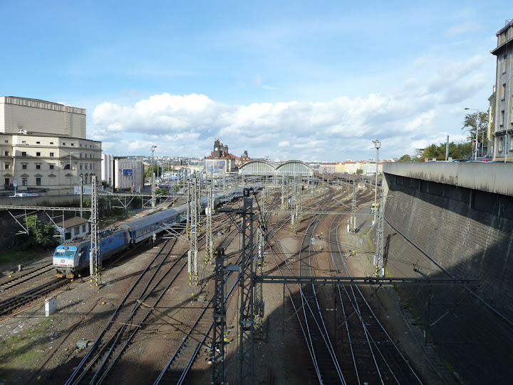
After this I knew that I would end up at Wenceslaw Square where are obvious 'items' to take a photo of. My hourglass was stopping me at different places and not even the best places to be taking photos. So I decided to improvise. I was choosing objects that pleased my eye and seemed interesting enough to be put to memory.
 |  |
 |  |
Few more flowers and a statue followed. After a while I ended up a bridge. Two stops at the bridge. I couldn't help and do the obvious photo. The second photo was rather different^^
 | 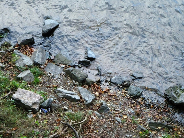 |
Some photos have really beautiful or really bizarre colors. The green, red and yellows are really beautiful nowadays and the sky was changing color when I was arriving to my destination. At one part of the sky it seemed that a storm was coming. On the other side it was light blue with beautiful white clouds.
| |
 |  |

To view all the photos in chronological order go to my Google Gallery.


Subscribe to:
Posts (Atom)


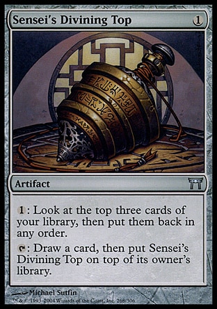