


Sunday, November 13, 2011
Drawing cats
Labels:
Visual Production
0
comments
Fantasy artist should be able to draw plants, animals, characters and landscapes. So my next subject is ... a cat. I made few attempts and still can't figure out how to draw fur^^. But one can actually see that it is a cat. Good start^^.

Friday, November 11, 2011
Is Fantasy Art yielding to pressure of globalized commercialization?
Labels:
Reflective Case Study
0
comments
Which factors play a role in globalizing Fantasy Art?
Is Fantasy Art yielding to pressure of globalized commercialization?
It is time for me to figure out my arguments and the structure of the work. I also need to settle on one specific question/topic and it's hard to do so. Especially when there aren't people really talking or writing about this.
To write my paper I need to define two things - Fantasy Art and Fantasy Fine Art. I'll be primarily talking about Fantasy Art as this is the area I would like to end up as a professional artist.
First of all I should define what art is. But well people can't really agree on that much. Anyway it is something we create that awakens are senses and what evokes emotion. It is a work of expression and take all kind of forms.
Fantasy Art in my case is any art produced for commercial use that has fantastic elements in it. Most Fantasy art is done for book covers for Fantasy literature, fantasy oriented magazines, rule books for Role Playing Games and Trading Card Games. The author of a Fantasy Art is someone who gets a description of the work he is supposed to do and does exactly that.
Fantasy Art thus is an illustration of a story that the viewer of the art is familiar with (or will be after finishing the book, playing the game etc)
Fantasy Fine Art is an art produced by an artist himself without any constraints by a client. Thus it can express the author's feelings and fantasies and does not relate to an existing story whatsoever.
Finding out about existing Fantasy Fine Art and artists doing this kind of division I tried to find a question that would lead me to an answer to what I'm interested. My whole research and information in it always had a fallback - commercial sphere and globalization thus. So I'd like to speak about the factors that have globalizing effect on Fantasy Art but actually...I can look at it from the other side. How about globalization having effect on FA and in this case the main reason would be - commerce. That is why I will try to settle on
Is Fantasy Art yielding to pressure of globalized commercialization?From what I said earlier about Fantasy Art we can see already few elements that play a role in globalization of Fantasy Art. Some of the aspects are tightly related to the commercial sphere.
We as the end user have to be attracted by the art that is given to us. It has to be pleasing and it has to catch our eye in terms of milliseconds (1).
Fantasy genre works with tropes like magic, medievalism, quest etc. This is something we expect of fantasy. Not only it tells us that 'this is fantasy' but it also limits the authors of fantasy in a way(2).
Many people agree on that Modern fantasy as we see today was due to Tolkien's Lord of the Rings. As I found out many artists don't even consider this option. They'll just say 'fantasy was always here, it would eventually find its way'. But still Tolkien and later TSR by creating the first role playing game set some kind of rules that turned into fantasy tropes. And even if they are different in different fantasy worlds they still exist. Magic can have various forms. Elves from one world can be completely different from other elves from a different world etc.
Working as a Fantasy Artist means that the artist gets a description of what he is supposed to do from a client. The artwork done probably needs to fit a certain setting (with this word this time I mean anything from matching style, design or colors) already and that itself can limit the author and it may dictate the style of the work.(3)
Like this we more perceive the artwork as being a part of something and we usually think about it that way. This and that artwork are both similar in design and come from the same setting but different authors - for example World of Warcraft. But when we look at artwork for Magic: The Gathering the style is different but the same two artists follow some kind of invisible guidelines for the MtG setting. (see Pete Venters for exmaple)
This also leads us to 'how was fantasy [genre] created?'(4)?
The genre was always there. We always had fantasies and dreams about something. At the beginning of 20th century pulp magazines were the place to look for fantasy fiction many times accompanied by illustrations. Later novels and books appeared but the popularity greatly rose with the publishing of Lord of the Rings by Tolkien. Many writers and artist continued in this genre of fantasy. It was much more publicly known and the public started to get used to it. The game industry strengthen this genre much more.
Now with the digital age use of computer is on the rise and this plays a big role as well. Does it have an impact on how Fantasy Art looks like? Partly yes. (5)
The computer is a really good tool for someone who needs to work fast. It helps the artists to meet deadlines and also brings in elements that do not exist while using traditional media. There are artists that experiment with what computer can do and many try to see how far the artwork can look photo realistic. See Brad Rigney.
to be continued...
Thursday, November 10, 2011
Vampiric Tutor alter
Labels:
Visual Production
0
comments
The past week was really difficult. My brain seemed to be turned off for the whole week, I couldn't concentrate, was easily distracted and couldn't simply work. That's probably also why I did not really try something more experimental nor managed to work on my RCS. That's also a reason why I decided to do a Magic Alter once again.
I bought a rather expensive card but it was in a really bad state. Doing an alter usually means masking all that up. I've already done this card's extended borders in the past and I was struggling with it A LOT. So what I wanted to learn?
- how to mix the right color, in this case I decided to go with a basecoat in grey and then 'color' the cards background in shades of that grey (which unfortunately was with hints of green----).
- how to get rid of paint from the name and type of the card (also meaning learning how to edit the work)
Simply enough right? Well not really. It was rather tedious...and I even forgot to document the work (*facepalm*). Seriously I couldn't do a simple task right in the past week...
Step 1
I started with erasing all the parts that I would paint on. As the card was not only damaged but also greasy and dirty I needed to get rid of that somehow as the paint wouldn't adhere to it as I already found out. (I've actually done this early after I bought the card...so people were staring at the partly blanked card for a while...as I played with it)
Step 2
After that I mixed some grey and applied it. This created a solid base coat. I wanted to hide all the 3d scratches and residues from both permanent markers and the dirt. I was partly successful.
Step 3
I decided to use shades of grey to determine the highlights and shadows. For that I used black and white as a starting point and then I used shades of grey to determine the rest. I just used blocks of colors, it wasn't detailed enough I would say...
Step 4
I tried to mix the goddamn yellow. Well, yellow color always shows differently on a screen after it's been scanned or photographed for some reason. Anyway my problem was that the green was always ending up green. So I tried adding pink and orange and well...it came up differently as well. I tried to mix the hues according to the grey ones, but I failed. Maybe I should try this with a color I don't have such problems mixing. Or well start with a basic color I own.
Step 5
I did the rest of the card in similar fashion with similar incapability of doing it right. Something was simply missing...and I couldn't figure out what that is until one artist made a comment about it.
Step 6
Getting rid of the paint at places I did not want it to be. I already learned few things
- one can get rid of the paint by using water and brush or some paper cloth or whatever
- one can get rid of one layer of paint each time
- one can actually scratch the paint off
Not sure how this will be applicable to larger paintings as this probably won't be something I would want to do. Acrylics can simply cover the areas I messed up somehow.
Finished tutor, at least for that day.
After I finished this I posted on mtgsalvation to get some feedback. People know me already even though I'm no expert at doing this and my work does not stand out. I met many artist who consider me aspiring one so in a way this helps me continuing. This means for me that people actually PM me with their input and I find this very useful. Anyway the image above this text is my scanned version and the one below is slightly edited one.
The differences are in highlights and making things even more cohesive and better looking. Few lines actually make it look much better. Good lesson. Now I need to be able to see this as well in drawings/paintings and such. Hopefully more b/w drawings and paintings will help me with that.
I bought a rather expensive card but it was in a really bad state. Doing an alter usually means masking all that up. I've already done this card's extended borders in the past and I was struggling with it A LOT. So what I wanted to learn?
- how to mix the right color, in this case I decided to go with a basecoat in grey and then 'color' the cards background in shades of that grey (which unfortunately was with hints of green----).
- how to get rid of paint from the name and type of the card (also meaning learning how to edit the work)
Simply enough right? Well not really. It was rather tedious...and I even forgot to document the work (*facepalm*). Seriously I couldn't do a simple task right in the past week...
Step 1
I started with erasing all the parts that I would paint on. As the card was not only damaged but also greasy and dirty I needed to get rid of that somehow as the paint wouldn't adhere to it as I already found out. (I've actually done this early after I bought the card...so people were staring at the partly blanked card for a while...as I played with it)
Step 2
After that I mixed some grey and applied it. This created a solid base coat. I wanted to hide all the 3d scratches and residues from both permanent markers and the dirt. I was partly successful.
Step 3
I decided to use shades of grey to determine the highlights and shadows. For that I used black and white as a starting point and then I used shades of grey to determine the rest. I just used blocks of colors, it wasn't detailed enough I would say...
Step 4
I tried to mix the goddamn yellow. Well, yellow color always shows differently on a screen after it's been scanned or photographed for some reason. Anyway my problem was that the green was always ending up green. So I tried adding pink and orange and well...it came up differently as well. I tried to mix the hues according to the grey ones, but I failed. Maybe I should try this with a color I don't have such problems mixing. Or well start with a basic color I own.
Step 5
I did the rest of the card in similar fashion with similar incapability of doing it right. Something was simply missing...and I couldn't figure out what that is until one artist made a comment about it.
Step 6
Getting rid of the paint at places I did not want it to be. I already learned few things
- one can get rid of the paint by using water and brush or some paper cloth or whatever
- one can get rid of one layer of paint each time
- one can actually scratch the paint off
Not sure how this will be applicable to larger paintings as this probably won't be something I would want to do. Acrylics can simply cover the areas I messed up somehow.
Finished tutor, at least for that day.

After I finished this I posted on mtgsalvation to get some feedback. People know me already even though I'm no expert at doing this and my work does not stand out. I met many artist who consider me aspiring one so in a way this helps me continuing. This means for me that people actually PM me with their input and I find this very useful. Anyway the image above this text is my scanned version and the one below is slightly edited one.
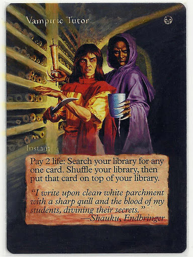
The differences are in highlights and making things even more cohesive and better looking. Few lines actually make it look much better. Good lesson. Now I need to be able to see this as well in drawings/paintings and such. Hopefully more b/w drawings and paintings will help me with that.
Art Directors vs Artists
Labels:
Reflective Case Study
0
comments
Sensory Deprivation
I spent a night and half a day searching some information about what the descriptions from Art Directors look like and what comes out of it. I went through several blogs of artist I know and came upon this.
Sensory Deprivation is a card in two games from the same company (Wizards of the Coast). One is from Vampires: The Eternal Struggle which is a dead game already (but there are still players playing it) and the other one is from Magic: The Gathering released in the last set that is set in the world of Innistrad. Innistrad is a gothic, creepy place that has walking dead, werewolfs, ghosts, vampires etc. Horror place...in general.
Now look at the two paintings (erm the cards it was printed on).
WotC nor Steven Belledin made a connection to the first Sensory Deprivation (for more read the original blog post). What I want to talk about is about my perception of this image. Because it was identical to both of these artists illustration.
Before a new set is released there spoilers of the cards can be found on the internet. There are sites that gather all the leaked images, text or translations. I check the spoilers at mtgsalvation. On the spoiler page all you have is the info player is interested + link to an image if it exists. I don't click on those, I usually wait till the set is released. When Sensory Deprivation showed up on twitter...I had a clear idea of how the image on the card would look like. I imagined a pale face with mouth and eyes "stitched" together (with skin actually). It would be close up and the background would be blue. Why did I have a very similar idea in my head? I actually did not envision the person to be dead but alive probably making it even more creepy (but I guess that depends).
Color
When talking to Bethany and one more person (can't recall who told me this...) our conversation came down to one question... 'why do I have the feeling that cards from a certain set have similar colors?' I pondered about this for a while as this is something that did not really strike me. I know that the colors can shift in contrast or even slightly different color feel to it.(when doing an alteration of Vampiric Tutor from Visions I realized that it has different colors from Japanese Vampiric Tutor from 6th edition). But I never seemed to notice that all the cards from the set would have something in common. In way they do...
I came across this late this night.

Anyway discussing Magic: The Gathering card artwork wasn't what I was looking for. But as most of the artist do a lot of artwork for Wizards of the Coast it was what I was usually encountering. Anyway... I learned that the Art Director gives a description of a card and states a color of the card usually or in case of WoW he/she states where the scene takes place or from where the characters is. The artist submit their work and then they are sometimes asked to put in more color. But it does not seem that the artists were given a color palette at the beginning. They just do what they think is appropriate and usually change the final image for print digitally for the client if he asks the artist to change it. The client does not do the corrections as I thought that this could actually be the case but it isn't. Because as someone noted... the sets in certain card games really are consistant in design.
Magic: The Gathering related note. Terese Nielsen was asked to do artwork for Force of Will. The description given to her was about a red mage and stopping magic. The final image ended up being REALLY red but...
...was printed on a blue card.
So well I came to the conclusion that the original artwork and the published print version are usually really close to each other. The client sometimes even wants something that seems not suitable for a certain artwork but the artist still does it to please the client. We can usually find the original artwork on the internet and we can compare it.
Style
While going through a lot of artwork I realized that more and more artists have different styles for different clients. Some artists variety in artwork is really huge - Ed Beards, Scott Altmann, Jim Nelson ....
Even though I have to admit that pencil/pen/ink sketches or illustrations are sometimes difficult for me to assign to an artist. Unless I've seen a lot of B/W work from them already.
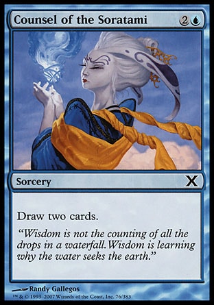
For example I have difficulties saying that this(first image below) and this (second image) was done by the same author. Both of these show Counsel of the Soratami. But there are artists that have their distinct style in their sketches and doodles (um how to call it, no offense to the artist) done by a pencil .
Conclusion
What the masses see is thus general in design and color palette and shows what the viewer would want to see. This creates a wide range of clichés (tropes, many elements did not end up clichéd yet) and archetypes that we get used too. Many artists are used to drawing a certain race or type of characters (reapers - Altmann, angels - Nielsen, goblins - Venters etc). The fact that the illustrations are for commercial use takes a big role in fantasy art. The 'community' are used to see something and they expect something. We have fantasy tropes that get get reproduced all the time. For example we had a Vampire/Werewolf wave. The artwork produced was similar in design. Mostly because it draws from horror and gothic fiction tropes that are already well established (comes from gothic era and romanticism)
I spent a night and half a day searching some information about what the descriptions from Art Directors look like and what comes out of it. I went through several blogs of artist I know and came upon this.
Sensory Deprivation is a card in two games from the same company (Wizards of the Coast). One is from Vampires: The Eternal Struggle which is a dead game already (but there are still players playing it) and the other one is from Magic: The Gathering released in the last set that is set in the world of Innistrad. Innistrad is a gothic, creepy place that has walking dead, werewolfs, ghosts, vampires etc. Horror place...in general.
Now look at the two paintings (erm the cards it was printed on).
 | 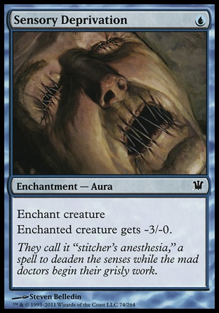 |
WotC nor Steven Belledin made a connection to the first Sensory Deprivation (for more read the original blog post). What I want to talk about is about my perception of this image. Because it was identical to both of these artists illustration.
Before a new set is released there spoilers of the cards can be found on the internet. There are sites that gather all the leaked images, text or translations. I check the spoilers at mtgsalvation. On the spoiler page all you have is the info player is interested + link to an image if it exists. I don't click on those, I usually wait till the set is released. When Sensory Deprivation showed up on twitter...I had a clear idea of how the image on the card would look like. I imagined a pale face with mouth and eyes "stitched" together (with skin actually). It would be close up and the background would be blue. Why did I have a very similar idea in my head? I actually did not envision the person to be dead but alive probably making it even more creepy (but I guess that depends).
Color
[Talking about Elesh Norn] On top of that, both the style guide and Elesh's brief make it clear I should avoid making the final illustration overly dark and brooding. Magic is defined by its mechanical colour philosophy and an illustration on a white card shouldn't be mistaken for something that could end up on a black or red one. [Kieryluk, ImagineFX Nov 2011]
When talking to Bethany and one more person (can't recall who told me this...) our conversation came down to one question... 'why do I have the feeling that cards from a certain set have similar colors?' I pondered about this for a while as this is something that did not really strike me. I know that the colors can shift in contrast or even slightly different color feel to it.(when doing an alteration of Vampiric Tutor from Visions I realized that it has different colors from Japanese Vampiric Tutor from 6th edition). But I never seemed to notice that all the cards from the set would have something in common. In way they do...
I came across this late this night.
"Must everything be color coded? Is it absolutly neccessary that all zombies be black instead of a putrid blue-green, all basalisks be emerald instead of pleasingly variant as are reptiles in nature, all artifacts be the exact same shade of uninteresting? And don't get me started on ever damn wizard and warrior wearing the appropriate colored clothing like the entire Keld nation recieved a signed memo from the king stating "Sat-Thurs strick red-based dress code enforced, Fri casual." Point is, can things be the color they are, not the color that it costs to cast them?" [Deaderpool, 2011].Actually this statement by deaderpool from wizards of the coast forums is correct. When you look at the visual spoiler by color you'll notice that each color (in terms of magic) has its own color palette. (I show you just two colors - white and blue, but it holds true for the rest of the colors as well). Igor Kieryluk's quote sums it up.
Anyway discussing Magic: The Gathering card artwork wasn't what I was looking for. But as most of the artist do a lot of artwork for Wizards of the Coast it was what I was usually encountering. Anyway... I learned that the Art Director gives a description of a card and states a color of the card usually or in case of WoW he/she states where the scene takes place or from where the characters is. The artist submit their work and then they are sometimes asked to put in more color. But it does not seem that the artists were given a color palette at the beginning. They just do what they think is appropriate and usually change the final image for print digitally for the client if he asks the artist to change it. The client does not do the corrections as I thought that this could actually be the case but it isn't. Because as someone noted... the sets in certain card games really are consistant in design.
Magic: The Gathering related note. Terese Nielsen was asked to do artwork for Force of Will. The description given to her was about a red mage and stopping magic. The final image ended up being REALLY red but...
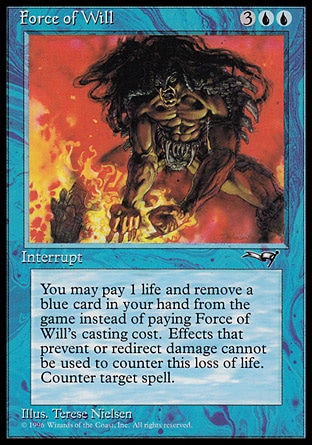
...was printed on a blue card.
So well I came to the conclusion that the original artwork and the published print version are usually really close to each other. The client sometimes even wants something that seems not suitable for a certain artwork but the artist still does it to please the client. We can usually find the original artwork on the internet and we can compare it.
Style
While going through a lot of artwork I realized that more and more artists have different styles for different clients. Some artists variety in artwork is really huge - Ed Beards, Scott Altmann, Jim Nelson ....
Even though I have to admit that pencil/pen/ink sketches or illustrations are sometimes difficult for me to assign to an artist. Unless I've seen a lot of B/W work from them already.
For example I have difficulties saying that this(first image below) and this (second image) was done by the same author. Both of these show Counsel of the Soratami. But there are artists that have their distinct style in their sketches and doodles (um how to call it, no offense to the artist) done by a pencil .
 |  |
Conclusion
"Fantasy seems to have, like the folk tales from which it sprang, a restricted number of recurrent motifs and elements: there are young, questing heroes, wise controlling sages, irredeemably evil monsters, and (although, mercifully fewer these days) damsels in distress (Propp, 1075). It might seem that the most visible form, 'sword and sorcery' genre fantasy, is doomed to die of repetion and parody - as in Terry Pratchett's 'Discworld' series, or Diana Wynne Jones's 'The Tough Guide to Fantasyland which mercifully catalogues every cliché: [...]" [Hunt, Lenz, Millicent 2004]
What the masses see is thus general in design and color palette and shows what the viewer would want to see. This creates a wide range of clichés (tropes, many elements did not end up clichéd yet) and archetypes that we get used too. Many artists are used to drawing a certain race or type of characters (reapers - Altmann, angels - Nielsen, goblins - Venters etc). The fact that the illustrations are for commercial use takes a big role in fantasy art. The 'community' are used to see something and they expect something. We have fantasy tropes that get get reproduced all the time. For example we had a Vampire/Werewolf wave. The artwork produced was similar in design. Mostly because it draws from horror and gothic fiction tropes that are already well established (comes from gothic era and romanticism)
Monday, November 7, 2011
Defining Space - Polyhedra
Labels:
Visual Production
0
comments
I was wondering how I could show or define space and I remembered one post I made earlier on my blog. I was describing how to create a
Menger sponge out of cards. I know that a card is a 3d object but when we look at it we take it as something planar rather than something um... cuboid.
So I decided to do something similar. But I wanted to explore polyhedra. I like fractals, steller objects and the basic polyhedra in general so this seemed as the right thing to do. Creating this needs a good conception of space and by doing this we create an object that we really perceive as an 3d object.
Menger sponge out of cards. I know that a card is a 3d object but when we look at it we take it as something planar rather than something um... cuboid.
So I decided to do something similar. But I wanted to explore polyhedra. I like fractals, steller objects and the basic polyhedra in general so this seemed as the right thing to do. Creating this needs a good conception of space and by doing this we create an object that we really perceive as an 3d object.

Sunday, November 6, 2011
Generalization of Fantasy 'Art'
Labels:
Reflective Case Study
0
comments
What are the factors that lead to generalization of Fantasy Art?
I'll be updating this post (if I manage to work...can't seem to concentrate on anything)
Computer as a medium
Computer is a tool. It means that artist can work faster and it gives them the possibility to create something that wasn't possible with the use of traditional media. Many artist now try to figure out where the limits of a computer are. Those who try this produce work that looks relatively similar.
Influences/Closed community
Many Fantasy Artists know each other and meet at conventions, fairs, tournaments or at work. This also plays a big role as we are influenced by what we see. This can also lead to some kind of generalization in design.
Many new artist emerge and they are influenced and motivated by the well established artists already. As they see themselves in them, their style becomes oftentimes similar no matter if they like it or not. Only few artist develop a style that is really striking and a lot different.
Art Directors
Fantasy Artists work for different companies. Many of them do work for trading card games, role playing games, book covers or other illustrations that show what's in a story. Now if I take card games as an example.
How does it change the style and design of the final piece? It does change the design. Not only you have to know how for example Elf looks in this or that game but you also have to follow certain 'art rules' to keep the whole set/game cohesive.
For example if we look at Pete Venter's work. He's been drawing Goblins for years. He's doing illustrations for both Wizards of the Coast and Blizzard and you can easily distinguish what illustration was done for what company. But if you look at Venter's work that is not influenced by the client it is different in style.
Even artist with really distinct style have variances in the style according to the 'topic'. For example Terese Nielsen who is known for her ethereal and spiritual look of her paintings does illustration for Magic: The Gathering or Star Wars. But if you look her Angels where she does not really have much constraints her style is much more expressive and different to the ones I mentioned earlier.
Why is that so? Is it because someone says to the artist how it should be done? Or is it because of lack of time or there something else?
Fine Art
Fantasy Artists nowadays do a distinction between Fantasy Art - which is the one that illustrates something from something (for example certain character from World Of Warcraft) and Fantasy Fine Art that just ... is ...Something were someone did not dictate the author what should be on the painting. If these artist create such work or any other work in which there aren't constraints the work is usually quite a lot different to the one you are used to. Is it more about time spend on it or is it more about the fact that under such circumstances you can create a work that truly reflects your style and intention?
Aim
This is related to the commercial aspect as well. Fantasy Art actually has a function. It needs to attract the viewer. What the viewer wants actually changes with time. For example in pre-2008 females were usually depicted as 'damsels in distress' but from 2009 they have a completely different role. They are more like the 'bad-ass' woman.
"Most commercial art does this by relating to a target audience and making them recognize something familiar-it's about the art coming to meet the viewer. The purpose of a great work of SFF Art is almost exactly the opposite: it is to depict something alien, and then drag the viewer away from their world into the imagined world of the book, movie, or video game." [Panepinto, 2010]
I'll be updating this post (if I manage to work...can't seem to concentrate on anything)
Computer as a medium
Computer is a tool. It means that artist can work faster and it gives them the possibility to create something that wasn't possible with the use of traditional media. Many artist now try to figure out where the limits of a computer are. Those who try this produce work that looks relatively similar.
Influences/Closed community
Many Fantasy Artists know each other and meet at conventions, fairs, tournaments or at work. This also plays a big role as we are influenced by what we see. This can also lead to some kind of generalization in design.
Many new artist emerge and they are influenced and motivated by the well established artists already. As they see themselves in them, their style becomes oftentimes similar no matter if they like it or not. Only few artist develop a style that is really striking and a lot different.
Art Directors
Fantasy Artists work for different companies. Many of them do work for trading card games, role playing games, book covers or other illustrations that show what's in a story. Now if I take card games as an example.
How does it change the style and design of the final piece? It does change the design. Not only you have to know how for example Elf looks in this or that game but you also have to follow certain 'art rules' to keep the whole set/game cohesive.
For example if we look at Pete Venter's work. He's been drawing Goblins for years. He's doing illustrations for both Wizards of the Coast and Blizzard and you can easily distinguish what illustration was done for what company. But if you look at Venter's work that is not influenced by the client it is different in style.
Even artist with really distinct style have variances in the style according to the 'topic'. For example Terese Nielsen who is known for her ethereal and spiritual look of her paintings does illustration for Magic: The Gathering or Star Wars. But if you look her Angels where she does not really have much constraints her style is much more expressive and different to the ones I mentioned earlier.
Why is that so? Is it because someone says to the artist how it should be done? Or is it because of lack of time or there something else?
Fine Art
Fantasy Artists nowadays do a distinction between Fantasy Art - which is the one that illustrates something from something (for example certain character from World Of Warcraft) and Fantasy Fine Art that just ... is ...Something were someone did not dictate the author what should be on the painting. If these artist create such work or any other work in which there aren't constraints the work is usually quite a lot different to the one you are used to. Is it more about time spend on it or is it more about the fact that under such circumstances you can create a work that truly reflects your style and intention?
Aim
This is related to the commercial aspect as well. Fantasy Art actually has a function. It needs to attract the viewer. What the viewer wants actually changes with time. For example in pre-2008 females were usually depicted as 'damsels in distress' but from 2009 they have a completely different role. They are more like the 'bad-ass' woman.
"Most commercial art does this by relating to a target audience and making them recognize something familiar-it's about the art coming to meet the viewer. The purpose of a great work of SFF Art is almost exactly the opposite: it is to depict something alien, and then drag the viewer away from their world into the imagined world of the book, movie, or video game." [Panepinto, 2010]
Saturday, November 5, 2011



Subscribe to:
Posts (Atom)

 Posts


