


I spent a night and half a day searching some information about what the descriptions from Art Directors look like and what comes out of it. I went through several blogs of artist I know and came upon this.
Sensory Deprivation is a card in two games from the same company (Wizards of the Coast). One is from Vampires: The Eternal Struggle which is a dead game already (but there are still players playing it) and the other one is from Magic: The Gathering released in the last set that is set in the world of Innistrad. Innistrad is a gothic, creepy place that has walking dead, werewolfs, ghosts, vampires etc. Horror place...in general.
Now look at the two paintings (erm the cards it was printed on).
 | 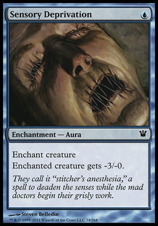 |
WotC nor Steven Belledin made a connection to the first Sensory Deprivation (for more read the original blog post). What I want to talk about is about my perception of this image. Because it was identical to both of these artists illustration.
Before a new set is released there spoilers of the cards can be found on the internet. There are sites that gather all the leaked images, text or translations. I check the spoilers at mtgsalvation. On the spoiler page all you have is the info player is interested + link to an image if it exists. I don't click on those, I usually wait till the set is released. When Sensory Deprivation showed up on twitter...I had a clear idea of how the image on the card would look like. I imagined a pale face with mouth and eyes "stitched" together (with skin actually). It would be close up and the background would be blue. Why did I have a very similar idea in my head? I actually did not envision the person to be dead but alive probably making it even more creepy (but I guess that depends).
Color
[Talking about Elesh Norn] On top of that, both the style guide and Elesh's brief make it clear I should avoid making the final illustration overly dark and brooding. Magic is defined by its mechanical colour philosophy and an illustration on a white card shouldn't be mistaken for something that could end up on a black or red one. [Kieryluk, ImagineFX Nov 2011]
When talking to Bethany and one more person (can't recall who told me this...) our conversation came down to one question... 'why do I have the feeling that cards from a certain set have similar colors?' I pondered about this for a while as this is something that did not really strike me. I know that the colors can shift in contrast or even slightly different color feel to it.(when doing an alteration of Vampiric Tutor from Visions I realized that it has different colors from Japanese Vampiric Tutor from 6th edition). But I never seemed to notice that all the cards from the set would have something in common. In way they do...
I came across this late this night.
"Must everything be color coded? Is it absolutly neccessary that all zombies be black instead of a putrid blue-green, all basalisks be emerald instead of pleasingly variant as are reptiles in nature, all artifacts be the exact same shade of uninteresting? And don't get me started on ever damn wizard and warrior wearing the appropriate colored clothing like the entire Keld nation recieved a signed memo from the king stating "Sat-Thurs strick red-based dress code enforced, Fri casual." Point is, can things be the color they are, not the color that it costs to cast them?" [Deaderpool, 2011].Actually this statement by deaderpool from wizards of the coast forums is correct. When you look at the visual spoiler by color you'll notice that each color (in terms of magic) has its own color palette. (I show you just two colors - white and blue, but it holds true for the rest of the colors as well). Igor Kieryluk's quote sums it up.

Anyway discussing Magic: The Gathering card artwork wasn't what I was looking for. But as most of the artist do a lot of artwork for Wizards of the Coast it was what I was usually encountering. Anyway... I learned that the Art Director gives a description of a card and states a color of the card usually or in case of WoW he/she states where the scene takes place or from where the characters is. The artist submit their work and then they are sometimes asked to put in more color. But it does not seem that the artists were given a color palette at the beginning. They just do what they think is appropriate and usually change the final image for print digitally for the client if he asks the artist to change it. The client does not do the corrections as I thought that this could actually be the case but it isn't. Because as someone noted... the sets in certain card games really are consistant in design.
Magic: The Gathering related note. Terese Nielsen was asked to do artwork for Force of Will. The description given to her was about a red mage and stopping magic. The final image ended up being REALLY red but...
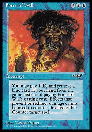
...was printed on a blue card.
So well I came to the conclusion that the original artwork and the published print version are usually really close to each other. The client sometimes even wants something that seems not suitable for a certain artwork but the artist still does it to please the client. We can usually find the original artwork on the internet and we can compare it.
Style
While going through a lot of artwork I realized that more and more artists have different styles for different clients. Some artists variety in artwork is really huge - Ed Beards, Scott Altmann, Jim Nelson ....
Even though I have to admit that pencil/pen/ink sketches or illustrations are sometimes difficult for me to assign to an artist. Unless I've seen a lot of B/W work from them already.
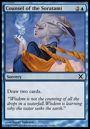
For example I have difficulties saying that this(first image below) and this (second image) was done by the same author. Both of these show Counsel of the Soratami. But there are artists that have their distinct style in their sketches and doodles (um how to call it, no offense to the artist) done by a pencil .
 |  |
Conclusion
"Fantasy seems to have, like the folk tales from which it sprang, a restricted number of recurrent motifs and elements: there are young, questing heroes, wise controlling sages, irredeemably evil monsters, and (although, mercifully fewer these days) damsels in distress (Propp, 1075). It might seem that the most visible form, 'sword and sorcery' genre fantasy, is doomed to die of repetion and parody - as in Terry Pratchett's 'Discworld' series, or Diana Wynne Jones's 'The Tough Guide to Fantasyland which mercifully catalogues every cliché: [...]" [Hunt, Lenz, Millicent 2004]
What the masses see is thus general in design and color palette and shows what the viewer would want to see. This creates a wide range of clichés (tropes, many elements did not end up clichéd yet) and archetypes that we get used too. Many artists are used to drawing a certain race or type of characters (reapers - Altmann, angels - Nielsen, goblins - Venters etc). The fact that the illustrations are for commercial use takes a big role in fantasy art. The 'community' are used to see something and they expect something. We have fantasy tropes that get get reproduced all the time. For example we had a Vampire/Werewolf wave. The artwork produced was similar in design. Mostly because it draws from horror and gothic fiction tropes that are already well established (comes from gothic era and romanticism)


0 comments:
Post a Comment